posted September 22 2011
a quick note on smartphone data
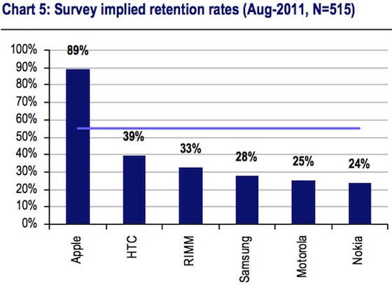
I was supposed to do something important and time consuming today, but that turned out not to be the case (not my fault). So to kill time, I thought I’d take a shot at channeling Junk Charts. MacRumors reported today on an analysis from UBS focusing on smartphone brand retention rates. The data are compelling, but the presentation is lacking, if not exactly junky. First, UBS’s chart on brand retention rate:
 First of all, if you’re going to print the values of each bar anyway, why are you bothering to make a chart? A table would do just as well. Secondly, that horizontal line representing the mean is redundant; there are only six data points here, so a summary statistic isn’t really necessary. Third, if you absolutely must include a summary statistic, you should choose the median, not the mean. We’re dealing with a very small data set, and one of its values is obviously an outlier. In this case, a simple mean makes for an uninformative summary since it vastly underestimates Apple’s retention number while greatly overestimating the competition’s. The median is a much better choice:
 Now we can confidently say that most smartphone manufacturers have around a 30.5% retention rate, except for Apple, which retains a remarkable 89% of its customers.
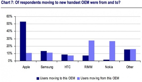
The graph of “smartphone switchers” is a more complicated affair:
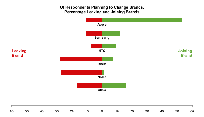
 Grouped bar charts are the Devil, alright? The alternating colors break the visual flow of the data and force the eye to work much harder to follow the story. Readers have to concentrate on colors and distances to pick up trends, rather than having them simply pop out. This data would be easier to follow if it had been split into two separate charts, one for “switching to” and another for “switching from”. Of course, it’s possible to arrange things nicely:
 This plot looks a bit fancy, but it’s really just two bar charts laid out horizontally and then arranged next to each other. I’ve also made an effort to be a little more descriptive. Rather than “switching from” and “switching to,” I’ve opted to call these categories “leaving” and “joining”. Color acts as a secondary cue: no one needs to be told that green is good and red is bad. In this configuration, trends in the smartphone landscape jump right out at the reader. People are still switching to the iPhone in droves, seemingly at the expense of RIMM and Nokia, who by the look of the things are in some serious trouble.
Whew. Feel better? I know I do.