posted December 20 2010
classification images and perceptual learning
 I became a published author as of a few weeks ago! The paper is titled “Perceptual learning of oriented gratings as revealed by classification images”, which is…a mouthful. Don’t get me wrong, I’m very proud of this. Designing the experiment, collecting the data, and writing the paper all added up to a tremendous learning experience, and the final product is a solid piece of work. Still, it’s not exactly beach reading. So, herein and forthwith, a plain-English explanation of this thing I just published. Yes, you too can understand science!
Before you can really understand what this paper is about, you need to understand perceptual learning. I’ve talked about this before, but here’s another quick primer. Learning of any sort requires practice, whether the goal is to recite all 50 state capitals from memory, ride a unicycle, or perhaps most interestingly, do both at once. In these examples, learning involves the parts of your brain that handle memory, motor skills, or both. Likewise, practice can also change the parts of your brain responsible for vision. When you perform a difficult visual task again and again (like, say, a dentist looking for cavities or a hunter looking for deer), the neurons responsible for processing this visual information become more refined, better at representing the important aspects of the task. It’s not that you simply understand what you’re looking at in a different way (which would be a change in strategy), it’s that you are literally getting better at seeing. Perceptual learning can enable a person to detect tiny changes in an object’s position, make a person more sensitive to detecting motion, enhance contrast sensitivity, and many other things.
So how do we measure perceptual learning? Typically we’ll sit you down in a dark, quiet room and give you a difficult visual task to do. At first you probably won’t be very good, and your answers will be random. But after making thousands of these visual decisions over several days, you will get better at it, and we’ll be able to measure that improvement. Usually we’ll boil all these trials down to a simple summary, like percent correct. The point is that we’ll sit you down for an hour at a time and have you complete 1,000 trials of an experiment, and out of all that data we’ll extract perhaps a handful of useful numbers.
This very common approach comes with some limitations. First, it seems a bit wasteful to sit someone down for a full hour and have only a few useful numbers to show for it. More importantly, though, remember that I’m using your behavior (how well you do on the task) to draw conclusions about what’s going on in your brain. This is problematic, because while I can see that you’re learning the task, I can’t say what, exactly, is being learned. This is one of the major debates in the field. Are you getting better at the task because your brain is becoming more sensitive to the important parts of the task, or because your brain is getting better at filtering out the parts that don’t matter?
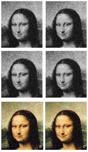 Suppose that instead of walking away with a handful of numbers, I was able to produce an image from your data, a picture of the mental template you were using as you performed the task. To get an idea of what I mean, look at these images from a 2004 paper by Kontsevich and Tyler, charmingly titled, “What makes Mona Lisa smile?” The researchers were interested in what aspects of the Mona Lisa’s face influence her famously ambiguous smile. To answer this question, Kontsevich and Tyler took a picture of the Mona Lisa and then added what we call “visual noise,” basically frames of TV static. As you can see from the black and white images, the random noise alters the Mona Lisa’s expression in various small ways. Participants in the study were simply asked to classify whether all these different Mona Lisas looked happy or sad. Once that was done, all of the noise that was classified as making the Mona Lisa “happy” could be averaged together and then laid back on top of Mona Lisa, producing a “happy” Mona Lisa (right color image). Ditto all the “sad” noise, producing a sad Mona (left color image). The basic message? The mystery of Mona Lisa is all in the mouth.
Kontsevich and Tyler managed to produce these classification images very efficiently by layering the noise on top of the picture. But if you wanted to produce a classification image of the Mona Lisa purely from noise, you would need tens of thousands of trials before you started to get something that looked like a woman’s face. This presents a problem for those of us who study perceptual learning, because we usually like to examine how perceptual learning takes shape over the course of a few days. Therefore, we need a way to produce a good classification image purely from noise, and out of one hour’s worth of data. That way we can examine how the image changes day to day.
That’s really the whole point of our paper here: can we find a way to make good classification images from very little data, and if so, can we then analyze the classification image to figure out what, exactly, is changing as perceptual learning occurs?
We decided to apply this concept to a pretty classic task in the perceptual learning field: the detection of an oriented grating in noise. Oriented grating is just another way of saying “tilted stripe”. An hour a day for 10 training days, we’ll have you look at stimuli that are either 100% noise, or a mixture of noise and grating. The grating is always tilted to the same angle, until day 11, when we rotate everything 90 degrees (we call this the transfer session, since we want to see if your learning transfers to a grating of a different angle). In the image below, you see, from left to right, the training grating, the transfer grating, an example of what pure noise looks like, and an example of a noise/grating mixture.
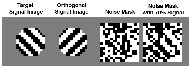
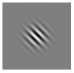 The trick to producing classification images from small amounts of data is to simplify your stimuli as much as possible. In most studies gratings look more like the image at the left, but in our study we’ve eliminated all shades of gray, and kept our stimuli very low-resolution. Each stimulus is just 16x16 pixels, but blown up to about the size of a Post-it note on the screen. This way, instead of each stimulus being composed of several thousand pixels and several hundred colors, ours have just 256 pixels and two colors.
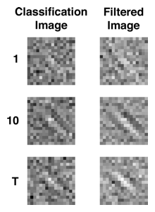 And it works! Here are classification images from one of our subjects for Day 1, Day 10, and the Transfer Day (“T”). As you can see, the classification image is fairly indistinct on Day 1, shows a much clearer stripe pattern by Day 10, and then gets worse again when the orientation is changed for the Transfer session (all images have been rotated to the same orientation for ease of comparison). In case the effect still isn’t clear, the right column applies some extra filtering to the images in the left to enhance the effect. And remember, while all our stimuli used only black or white pixels, the classification images have shades of gray because they represent an averaging of all those stimuli.
Our next hurdle was how, exactly, to measure the “goodness” of each classification image. Our solution was to calculate the Pearson correlation between each classification image and the target grating. In other words, a fairly straightforward measure of how well these two pictures match up, with 1.0 being a perfect score. Once you have that, you can see how the correlations change over time. In our data, image quality clearly improves for about six days, and then levels off. When we change the orientation of the target grating, performance drops back to square one:
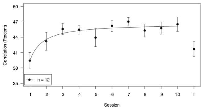
My more eagle-eyed readers might notice something ironic about all this. Did we just go through all this trouble to create a classification image, only to convert the image back to a simple number again? But wait, there’s more. What if I created a grating at every possible orientation, and then calculated how well a person’s classification image correlated with each of those? I end up with what we call a tuning function. Ordinarily you can only get those if you’re plugging wires into animals’ brains and directly measuring the activity of their neurons. But have a look:
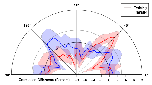 The red line represents the tuning function for Day 10 classification images. See where the red line intersects with the line labeled “45°”? That’s the equivalent of the Day 10 data point in the previous figure. But because I’ve gone through the trouble of creating this classification image and measuring its correlation with 180 different gratings, I can see much more than a single data point. I can see that there’s a big improvement immediately around the orientation that was trained, but that this improvement rapidly drops off as you move farther from it. In fact, most of the red line is below zero, indicating that the fit between the classification image and these other gratings has actually decreased, or been inhibited.
Then there’s the blue line, which represents the tuning function for Transfer Day. Its spike is 90 degrees away from the red line’s, which you’d expect. But the spike is also smaller and broader, indicating that learning to detect one grating transfers imperfectly to others. Also of interest, you might notice that the blue line has a noticeable “bump” near the spike of the red line. This suggests that even when subjects are told to search for this new Transfer grating, they are using a mental template that is tuned for what they had been trained on previously.
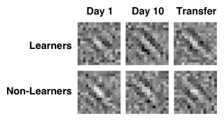 Lastly, no two people are ever going to produce identical classification images, which makes the images useful for revealing individual differences and strategies. Early on in this study, we noticed that some subjects produced very nice-looking images and showed very clear learning trends. Others seemed to produce murkier images and flat or even reversed learning effects (they seemed to get worse over time, not better). What to do with subjects like this is always a thorny question. So, we split the subjects into two groups: learners and non-learners. We found, somewhat surprisingly, that the so-called “non-learners” actually started off with better images than the “learners,” but that they never seemed to improve beyond their starting point. Our analyses showed that the non-learners tended to focus on the center of the stimuli. Their classification images looked like bright blobs, not stripes. It’s a perceptual strategy that worked well for them initially, but failed to generate measurable learning. Meanwhile, the learners started off a bit worse, but seemed to incorporate more of the stimulus into their decisions, and thus produced better classification images. In other words, the non-learners were lazy, and we were able to see and quantify this thanks to the classification images.
That, ladies and gentlemen, is the story: an efficient way to pull a picture out of a person’s brain, and what that picture can tell us about how that person learns. In closing, I’d like to point out that this thing didn’t spring fully formed from our minds. It was accepted for publication as of October, but for three years before that it was a work in progress. More than that, it was one huge learning experience for me. How to program the stimuli, how to design the experiment so that subjects don’t fall asleep in the middle of it, how to detect a cheater, how to analyze the data, how to slice and dice the data, how to ask questions, how to get answers, how to write it up, and how to handle the revisions, all of this was a a learn-on-the-job deal. I’d particularly like to thank my advisor on this project, Aaron Seitz, for all his help and guidance.