posted June 8 2024
x-men re-examined: come the apocalypse
Season 1, Episode 10. Air date: February 27, 1993
“Come the Apocalypse” peaks with its title. Disney Plus’s log line for this episode is, “Apocalypse turns mutants into the Horsemen,” and that about sums it up. It’s a rather poor first showing for Apocalypse, especially in light of the ominous buildup he was given in the last episode.
For the benefit of the uninitiated, Apocalypse is an ancient mutant (possibly the world’s first) with a limitless array of powers and abilities. Born far more powerful than any other being of his time, he became obsessed with the cultivation of ever greater power. Embracing the mantra of survival of the fittest, his goal is to create a race of elite super-mutants and destroy everything else, human and mutant alike. He is Professor Xavier’s worst fear, an all-powerful madman who cannot be reasoned with.
He hastily picks out four mutants from among those who have come to Muir Island for its “cure” to act as his extremely on-brand Four Horsemen. They emerge from the transformation with enhanced abilities, a unifying desire to do Apocalypse’s bidding, ugly new character designs, and extremely stupid-looking robotic horses to ride around on. Angel has become Death (also called Archangel once or twice here), Plague (previously seen with the Morlocks) has become Pestilence, and two others are Famine and War.
Apocalypse announces himself at Paris’s Conventional Weapons Disarmament Conference with the words, “I AM APOCALYPSE! LOOK UPON THE FUTURE! AND TREMBLE!” The animation is ridiculous. Apocalypse basically T-poses in front of the conference’s chairman. John Colicos’s vocal performance (or maybe the editing) is dialed to 11 but equally stiff. This episode makes Apocalypse look like an absolute clown.
Xavier sends the X-Men to deal with the Horsemen, while Rogue heads back to Muir Island to finally put together the pieces about the fake mutant cure. The diversion to Scotland is short, but more fun than anything else in the episode. Rogue immediately overpowers “Adler”, who reveals herself as Mystique and tells Rogue everything, including the location of Apocalypse’s lair at Stonehenge. Lenore Zann is reliably great as Rogue puts Mystique on the back foot, and there are a couple of nice animation touches, like Mystique transforming only the half of her body that’s facing Rogue (a cute wink at the fourth wall).
The Horsemen have by this point fanned out for a montage of misery, but between their debut in Paris, these random scenes of mayhem, and the upcoming fight at Stonehenge, it’s hard to track. The X-Men manage to knock Pestilence unconscious, who is scooped up by Archangel. The team then follows the defeated Horsemen to Stonehenge (you’d think Rogue might’ve just radioed them to bring them there).
Apocalypse is, needless to say, unhappy that his elite Horsemen have been defeated by mutants he didn’t personally handpick. The team has it easy in the final fight, so much so that the episode finds time for a nice Hero Shot of the team looking very rad. Rogue uses her power draining abilities on Archangel, which undoes his brainwashing and ends the fight, though he still looks super weird. Apocalypse retreats via his spaceship (???), and Archangel expresses remorse and shame over being unable to control Apocalypse’s evil influence.
I’m torn on whether Apocalypse’s various actions here are intended to show that his long-held god complex is out of step with modern times, or just bad writing. Centuries ago, sure, any four mutants he chose to elevate would have wiped the floor with the human race. But now there’s this paraplegic psychic in upstate New York who’s spent years training an elite team of mutants all his own. Maybe Apocalypse shouldn’t have just picked the first four mutants he liked at Muir Island!
Stray observations:
-
As the season has gone on, I’ve noticed that it often uses a stealth two-part structure. This isn’t “The Cure: Part 2”, but Rogue is definitely still the episode’s main character. She has snappy one-on-one scenes with Mystique and Apocalypse (again, Zann is the show’s best actor), and typically has the most to say in the ensemble scenes.
-
Just before transforming Angel, Mystique-as-Adler tells him that he will soon be, “free of the pain caused by your mutantcy.” Mutantcy?
-
Gambit continues his S-tier flirting with Rogue. “You can drain my energy any time, cher. Gambit has plenty.”
-
As far as I’m aware, this is the first episode where Wolverine calls Cyclops “Cyke”.
-
This is the episode with the infamous shot of Rogue’s rear. A certain segment of the fandom brings up this specific screenshot to complain that X-Men ‘97’s animation isn’t “faithful” to the original. I think there’s no denying that the animators were having a good time in what was otherwise a pretty poor-looking episode, but this is hardly representative. In the ten episodes I’ve watched so far, the men are much more frequently on display than the women. There’s a reason that X-Men has such a huge gay following, folks.
posted June 2 2024
x-men re-examined: the cure
Season 1, Episode 9. Air date: February 20, 1993
Lenore Zann rules. As Rogue, she gives us a vocal performance big and bold enough to match the superwoman who throws cars around for fun, while still giving her line readings a lot of subtle shading. Zann communicates more emotional range and makes Rogue feel more lived in—more real—than any other member of the team. She is consistently the funniest main cast member, equal parts boy-crazy Southern belle and seasoned ass-kicker who ain’t got time for the villain of the week’s nonsense. Bringing Zann back to voice Rogue for X-Men ‘97 was surely a no-brainer. All this is to say, “The Cure” is our first Rogue-centric episode and it’s a real treat.
There’s a scientist working out of Muir Island in Scotland, one Gottfried Adler, who can reverse mutations. His technology is behind the power-suppressing collars used in Genosha, and he seems to be on the verge of perfecting a version of the tech that works permanently. Naturally, he’s a weird recluse. “Visitors are verboten,” he says through an intercom when Professor Xavier and Moira MacTaggert try to see him. You’d think Xavier would be more concerned about the psychic flash of two blue mutants (Mystique and Apocalypse), which sends him into paralytic shock.
Ominous visions aside, Xavier feels that the use of this technology (he refuses to call it a “cure”) is a personal choice for each mutant to make, and he informs his X-Men of its existence. Most of the team would rather die than give up their unique abilities, but of course, Rogue feels differently. Her life-draining powers mean that she can never hold hands with someone the way that Jean and Scott do, or make good on Gambit’s flirting:
Gambit: Let’s have a kiss before ya’ go, ah?
Rogue stops the car, gets out, and starts walking away.
Rogue: You know what happens when I touch somebody! You wanna end up in the hospital?
Gambit: Maybe it’s worth it, no?
I love this scene. You should all love this scene. I have no doubt that when they were developing X-Men ‘97, they had a screenshot of this scene next to the words, “LIKE THIS”. In a show that’s usually doing all it can to rush from one big thing to the next, it’s the first scene to give its characters some time to breathe. For a moment, it feels like an entirely different show. Zann and Potter are both great here, too.
Gambit’s flirting, which was meant to make Rogue feel better, does the opposite. Whatever ambivalence she might have felt before, it’s gone now. She’s flying to Scotland for her cure, immediately. By hitching a ride on the wing of a plane. The image is simultaneously silly, strange, and sad.
Rogue lands in a Muir Island bar where fan-favorite Pyro and guy-who-is-also-there Avalanche are waiting for Mystique. “She’s a shape-changer,” Pyro helpfully reminds Avalanche and the audience, “one never can be sure.” They briefly think Rogue is Mystique, and when it becomes apparent that she’s not, they decide to harass her anyway, because they are idiots. She promptly throws both of them through a concrete wall. Please, do not hold your applause.
To sum up a packed middle act, “Adler” is Mystique in disguise, and her machine does something other than remove mutant abilities. Apocalypse is very interested in using it on Rogue, and would have gotten away with it, were it not for Pyro and Avalanche trying to kidnap “Adler” at exactly the wrong moment. Mystique reveals herself to them just so she can yell at them for being huge tools. Rogue, having shrugged off about four tons of sci-fi debris, finds Pyro and Avalanche and hands them their own butts, again.
In the middle of all this is Cable, who wants to execute Dr. Adler for inventing Genosha’s power-suppressing collars. His superpower is that he can pop up wherever the script needs him to be, so while he can’t kill Adler (he’s already dead, Mystique explains), he can at least dilute an otherwise good episode. By this point Cyclops and Jean have arrived as this episode’s cavalry. They briefly fight Cable on a cliffside and Jean nearly falls to her death, rescued at the last second by Rogue.
In the end, Rogue declines Adler’s treatment, saying simply, “There ain’t no cure for who you are.” This is a versatile sentence that I think works equally well crocheted onto my friend’s pillows or chiseled onto my enemy’s tombstones, thank you.
Rogue accepts that her abilities are a net good, difficult though they may be. And it’s easy to see how she gets there. Throughout this episode she’s almost unstoppable. Her mighty deeds include: halting a fight between Wolverine and Gambit by dropping a belfry on Wolverine, hitching a plane to Scotland, tearing steel security doors off their hinges, resoundingly beating the crap out of Pyro and Avalanche (twice), and saving Jean’s life. For you it was the adventure of a lifetime, for Rogue it was Saturday.
As with Storm’s claustrophobia, Rogue is coping, not conquering. I wish the episode had done a little more to sell this self-realization. Maybe have a scene where Rogue pretends to live like a non-mutant for a day, and comes across some act of violence or hatred that she’s not allowed to do anything about. It would have eaten up a few minutes, but please, just trade it for all the unnecessary crap with Cable.
Ah yes, Cable. And Warren Worthington III, a.k.a. Angel. Warren is Dr. Adler’s wealthy benefactor, desperate for a treatment that will undo the curse of his majestic bird wings (and I assume, the proportionate upper body strength of a swan). The episode’s opening scene has Cable showing up at Warren’s secluded chateau to get a lead on Adler. The ensuing fight is awfully muddled. At one point, Warren surveys the landscape and says, “Warren’s gone,” which could be a commentary on having to reveal to his girlfriend that he’s a mutant, but I think more likely is a script error (I really think he was supposed to be talking about Cable). The scene ends with the girlfriend shooting him, though it’s unclear whether this is due to the confusion of the moment or out of fear of his wings. Either way, he flies off.
We don’t see him again until near the end of the episode, when he’s arriving at Muir Island and Rogue is just leaving:
Rogue and Angel bump into each other in midair.
Angel: How do you fly without wings?
Rogue: I dunno, I just do.
This little exchange left an impression on young me. I’m not kidding when I say that it is the best possible explanation for superpowers that this show, or any show, could possibly offer. People fly now, Warren, get over it!
The episode closes with Angel enthusiastically volunteering for “treatment”, and Apocalypse vowing to use him as a tool to destroy the world.
Stray observations:
-
On the topic of mutation-reversing technology, Xavier says, “Don’t say ‘cure’, Moira. Being a mutant isn’t a disease, it’s something you’re born with.” I wonder if this is a metaphor for anything, guys.
-
Pyro and Avalanche do the requisite work to help Mystique get through her exposition about Apocalypse and they still don’t understand any of it.
-
If Warren is so profoundly ashamed of his mutation, why does he have a superhero costume specifically designed to show it off?
-
Professor Xavier wears an adorable purple smoking jacket at night.
posted May 31 2024
x-men re-examined: the unstoppable juggernaut
Season 1, Episode 8. Air date: March 6, 1993. This is the first episode that aired out of sequence from the show’s production order. It originally aired after “The Cure” and “Come the Apocalypse”. I’m following the production order, which is the intended narrative order and the one used on Disney Plus.
This episode introduces two of Marvel’s largest men: Colossus and Juggernaut (Hulk sold separately). The Colossus segments are all very fun, and I think that if the episode had been about him exclusively, it would have been a great one. But these 22 minutes are also saddled with a pretty shallow version of Juggernaut and a story riddled with plot holes.
The X-Men return from Genosha to find the X-Mansion in ruins (in a sign of this episode’s poor writing, Gambit, who at the end of the last episode was on this very plane, has vanished into thin air). The team finds a message from the Professor saying that he’s gone off to talk to an old colleague of his about something important, which means the destruction of the mansion is entirely coincidental. Wolverine, Storm, Rogue, and Jubilee fan out into the city to figure out who could have done this.
Jubilee finds some teamsters, who are mad that their job is being handled by someone they refer to as “Super Russki” and “mutant scab”. It’s Colossus, who merrily demolishes the building as requested. Jubilee and Wolverine immediately assume he’s responsible for the destruction of the mansion. The X-Men, of all people, should definitely know better than to rush to this kind of judgment, but that’s the quality of writing we’re dealing with here.
One of the teamsters decides to drive a semi-truck into Colossus, who transforms into organic steel and lets it hit him at full speed. He doesn’t move an inch, while the truck crumples like paper. Despite this impressive display of power, Wolverine and Jubilee decide to take him on. They’re a poor match for Colossus’s sheer physical strength and he has little trouble shrugging them off. He mostly just seems very put upon by the whole ordeal, and exits the scene muttering about the strangeness of Americans.
Everybody rushes over to the aftermath of a bank robbery. Colossus somehow (bad writing) gets there faster than anyone, just to try to open a bank account and end up falsely arrested (at least it’s funny!). The X-Women decide to break Colossus out of jail, which leads to this classic moment:
Rogue: “Dear, dear! No back door!”
Colossus transforms into organic steel and punches through the wall, smiling at Rogue.
Rogue: “I just love it when he does that!”
Rogue is obviously strong enough to do this herself, which means she just wanted to see the Russian hunk show off. These two would have made a great couple.
Having left no real clues as to the identity of the bank robber other than super strength, the show decides to just reveal Juggernaut knocking over another bank minutes later. He’s a gigantic brute, crushing cars as he walks over them and tossing heavy artillery aside like toys. The episode is running out of time, so we learn a lot about him very quickly: he is monstrously strong and nigh invulnerable, he was looking for his hated brother, Xavier, which is how the mansion got wrecked, his helmet protects him from telepaths, his powers derive from magic rather than mutation,1 and he spouts an endless stream of grade-school puns. He has no motivation for the bank robberies other than being a bad guy and the writers having no other ideas.
It’s clear to Cyclops that to defeat this villain, they’ll have to work together “for a change”. The writers reached for an easy “value of teamwork” moral, but it makes absolutely no sense on this show, because we’ve seen the X-Men work together in almost every episode. Working together, playing off each other, and combining their abilities in novel ways is a big part of what makes X-Men so appealing. I mean come on!
Anyway, the team (including Colossus) does successfully team up, everyone chipping away, until Juggernaut’s helmet is ripped free. Jean finally puts the psychic whammy on him and he exits the scene with severe memory loss. Letting a super strong criminal who has no idea who he is or how strong he is just wander off seems incredibly reckless, no?
In the epilogue, the X-Men continue to rebuild the mansion (it’ll probably be fixed before Xavier even knows what happened), with more help from Colossus. Everybody likes him, and why wouldn’t you? He declines to join the team, as he must find his sister and see more of America. It’s a shame that we won’t be seeing much of him after this introductory story. His sheer strength makes him an interesting addition to the roster, plus he’s a funny fish out of water and has great chemistry with Rogue. If only, you know?
Now That’s What I Call ’90s: Juggernaut wondering if Colossus is recyclable.
Stray observations:
-
Gambit is on the toilet for this one, again.
-
In this episode Colossus is always referred to as “Colossus”, never by his given name, Piotr Rasputin. I love the vaguely Slavic music that plays whenever he has a scene.
-
After his brief fight with Colossus, Wolverine remarks, “Guy’s got a great arm.”
-
A surprise cameo from Beast! When the ladies decide to bust Colossus out of jail, Beast is in the next cell over, still eagerly awaiting his day in court. He refuses yet another jailbreak, but offers to “catch up on gossip” the next time the girls are around. We’ve barely seen Beast this season but he remains delightful. I’m so glad they brought George Buza back to voice him in X-Men ‘97.
-
Almost certainly meant to be the Crimson Gem of Cyttorak. ↩
posted May 25 2024
x-men re-examined: slave island
Season 1, Episode 7. Air date: February 13, 1993
So it turns out Genosha’s mutant-friendly advertising is a facade to capture mutants and use their powers for various forms of forced labor. Henry Gyrich and Bolivar Trask relocated the Sentinel program here after the events of “Night of the Sentinels”. Trask’s latest innovation is Master Mold (excellent and very toyetic villain name), a supersized Sentinel that can fully automate the production of other Sentinels. All it needs is a massive power supply, which is what the labor camp is building. This means that Storm, Gambit, and Jubilee wake up in a prison that uses the abilities of the oppressed to strengthen the oppressor. When Magneto finds out about this, he is going to be so angry, and so right.
Storm and Jubilee each try to lead their own rebellions against the camp’s leadership, and both fail (though it is cool to learn that Jubilee knows how to pick locks). Gambit is the lynchpin here, as he talks his way out of the labor camp and immediately uses an inch of freedom to double cross his captors. Along the way, he bumps into a hulking Schwarzenegger type with a glowing eye, a metal arm, and a lot of belt pouches. This guy, Cable, has been harassing the Genoshan leadership in a one-man insurrection for months, and with the chaos that the X-Men bring, he’ll be popping up seemingly everywhere to try to assassinate the Leader of Genosha.
Gambit returns to the labor camp and frees Storm and Jubilee from solitary confinement. Thanks to a key that Gambit got from Cable, they’re able to remove their power-suppressing collars and lead the mutant revolt we all want to see. In the riot, there’s Blob! And Northstar! And Sunfire! And Mystique??? She doesn’t do anything of note here and has no lines, so it’s possible that the animators just chose a random character for a background role, not realizing that she’d be much more important later. Storm goes into full Grand Pronouncement mode and blows apart the Sentinel factory with some monstrous weather. The cavalry arrives just in time to take everyone home, but as they approach the X-Mansion, they see it’s been destroyed (guess we’re just going to have to tune in next week!).
It’s great to see the show starting to make use of season-spanning continuity. Jubilee immediately recognizes Trask, and Trask recognizes the X-Men. The episode also makes a point of having Wolverine actually arrive back at the mansion and refuse to explain his disappearance, whereas in other shows, he’d just be back in place as if nothing happened. Even the creation of Master Mold makes sense, since Gyrich complained in the premiere that Sentinel production was too slow. But maybe Trask did his job a little too well. There’s a moment in the third act when Master Mold produces a new type of Sentinel without any direction from a human.
This episode is a real showcase for Storm and Gambit, who are a study in contrasts. Gambit immediately understands that Trask and Gyrich have every advantage, and that a head-on conflict will end badly. So he uses subterfuge and trickery to make himself valuable to the leadership (even if that means telling his captors a little about the X-Men). His heel turn feels plausible enough, especially since he went so far as to sell out Jubilee and sabotage her attempted revolt. He fools Jubilee and probably fooled a good number of the kids at home. Even in the epilogue, when Jubilee tells Gambit that she knew he’d never really betray them, he smiles and says, “How do you know you aren’t being fooled again?” Of course, actions speak louder than words. The instant Gambit had a little leverage, he executed the double cross. His primary power is that he can turn anything he touches into a bomb, and the writers use this to great effect. Sometimes he’ll slip a charged playing card into a door to blow it open, sometimes he’ll grab whatever’s nearby and turn it into a grenade, and in one instance here, he uses his powers on the car he’s being transported in to break free and cause a lot of chaos. He’s very fun to watch!
Storm, on the other hand, is a woman of principle. She immediately tries to rebel against her captors because that is the right thing to do (though it fails miserably and gets her thrown in solitary). She stops Blob from killing a guard during the mutant riot. Even when driven half-crazy from claustrophobia, she’s still trying to fulfill her role as leader and offer an example of strength to Jubilee. When she finally has access to her full powers, she does not hesitate to absolutely wreck the joint. It’s implied that Cable has been poking at Genosha’s corrupt leaders for months. It takes Storm about three minutes to conjure a typhoon that reduces their entire operation to rubble. And that’s Storm. She will give you every opportunity to do what’s right, and she will even do you the courtesy of announcing how thoroughly she is going to ruin you when you don’t. But if it gets to that point, kiss your plans, your evil robots, and everything within a five mile radius goodbye.
That’s the enduring appeal of X-Men. You can be the silver-tongued, unpredictable cardsharp or the type of drama queen who exacts revenge by way of a localized Category 7 hurricane, and both are extremely cool ways to save the day.
Stray observations:
-
The Leader of Genosha is some dork in a flowing purple robe. Nobody else is dressed like this. Even on a show where yellow spandex is normal, this looks funny to me.
-
The Leader mentions that the camp’s power-suppressing collars were invented by “a scientist from Scotland”. Coincidentally, Xavier stays behind at the mansion to get in touch with one Dr. Moira MacTaggert.
-
Master Mold, failing to get away from the collapsing facility: “I am still. Plugged. In!”
-
Cable’s sudden appearance here and implied backstory don’t make any sense in light of his role in later seasons, but then again he’s a time traveler, so whatever.
posted May 24 2024
x-men re-examined: cold vengeance
Season 1, Episode 6. Air date: February 6, 1993
If you love Wolverine, this episode is an A. If you don’t, it’s a C. They can’t all be generation-defining bangers, you know? We’re picking up with Wolverine, who has decided to clear his head with a trip home to Canada. He’s having a lovely time skiing around the middle of nowhere, when Sabretooth pops up yet again with a detonator in hand, somehow already well prepared to blow up the ice bridge Wolverine is skiing across. Their fight ends with Wolverine falling into a freezing river. “Let the ice be ya’ tombstone!” Sabretooth screams. Which, what is this accent, exactly? Philadelphia? I find it baffling.
Wolverine is luckily rescued by some local indigenous people. The show doesn’t attempt to name them as a specific tribe or nation, so let’s just leave it as “indigenous”. Given how these portrayals tended to go up until the—let me just check my notes—today, I’m already uncomfortable. Wolverine wakes up in the village and recovers fast (wink), and immediately ingratiates himself with the locals by being super strong and great at everything. The village’s previous #1 favorite person, Kiyoek, does not like this one bit, and he decides to collude with Sabretooth.
In a quiet moment, Wolverine comments that bringing some happiness to these kind strangers has made him happy, too, and the feeling is so foreign that he doesn’t know what to make of it. In a first for the show, he’s even smiling when he says this. All of this reads as incredibly sad to me. The show hasn’t gotten into the Weapon X stuff yet, but if you’re reading this, you’ve probably seen the movies. This dude has led a very traumatizing life.
You know Wolverine’s happiness can’t last. Kiyoek takes him ice fishing, and while they’re gone, Sabretooth ransacks the village and seemingly kidnaps its entire population. This leads to Cal Dodd’s incredible reading of the line, “THERE’S NO PEACE FOR ME!” As he walks toward another confrontation with his old enemy, he takes his mask out of a backpack. I think it’s supposed to read like John Wick un-burying his guns or Kratos retrieving the Blades of Chaos, but this is undercut by an earlier animation error where he woke up in his X-Men costume for no reason.
Sabretooth has gone full Snidely Whiplash. He’s got the villagers tied to an ice bridge and another detonator in his hand. Where, exactly, is he getting this stuff? Who is supplying him with C-4? How did he singlehandedly abduct and restrain what appears to be several dozen people? The show denies us answers. The actual fight isn’t all that great. Kiyoek redeems himself by intervening long enough to give Wolverine an edge, and in true Saturday morning cartoon fashion, Sabretooth miscalculates and lunges off a cliff (never to be seen again, I’m sure).
The episode’s depiction of the indigenous village isn’t too bad up to this point, but in the end they decide to move to the city rather than rebuild their old lives. The show portrays this as a happy ending, but man, that is not how it reads to me.
Barely in this episode at all, Storm, Jubilee, and Gambit (he’s fine after that encounter with Plague, apparently) are on a trip to investigate Genosha, purportedly a mutant-friendly nation. Cyclops was against sending anyone, and he’s such an unbearable jerk about it that even the Professor tells him to consider maybe chilling out. Genosha seems like a fun tropical getaway, never mind the retinal scanner that the hotel concierge is using without your consent, Storm. Everything’s cool until knockout gas starts seeping into the bungalow (like most AirBnBs I’ve stayed at, amirite?). The trio fight their way outside, only to be greeted by what look like some unused character designs from an episode of G.I. Joe and a single, looming Sentinel.
posted May 21 2024
x-men re-examined: captive hearts
Season 1, Episode 5. Air date: January 30, 1993
This episode has it all, and I can’t believe they managed to cram it into twenty-two minutes (okay, I can, the pacing is pretty abrupt). The inciting incident is that Cyclops and Jean go on a date and get abducted by the Morlocks. We will use this as a lens to examine Storm’s fears about leadership and Wolverine’s frustrations over his unrequited (?) feelings for Jean. Along the way, a shocking number of memes.
The tentpole of the episode concerns Storm’s doubts about her leadership abilities, and it manages to hang together as a coherent arc despite everything else going on around it. We see her fail at the start, as her claustrophobia overwhelms her in the Danger Room. Later, she leads the mission to rescue Cyclops and Jean, where she controls (but doesn’t conquer) her phobia. This requires her to lead the team through a Morlock melee and face their leader, Callisto, in single combat. She enters those tunnels insecure and unsure, and emerges as a queen. Literally, she’s formally the leader of the Morlocks after this, but she lets Callisto “rule” in her place. I think it’s especially important that the episode shows Storm keeping her fears in check, but not exactly getting over them. Growth is a process, even for a badass goddess like her.
Meanwhile, this episode finally leans into the soap opera of it all. Cyclops and Jean are very into each other and Wolverine can’t handle it. He and Jean share a tender moment early in the episode, only for Jean to tear herself away to go on her date with Cyclops. We then follow the lovebirds up until their capture, cutting back to the mansion for just a few seconds to see Wolverine in bed, tenderly touching a certain photo.
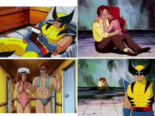 Yes, friends, this is that episode. The one that launched a thousand memes. In fact it doesn’t just give us Wolverine Crush, it also gives us Sad Wolverine, in which he looks like he’s posing for a missing tarot card called The Third Wheel. But wait, what if I told you that if you order now, in this very episode, you will also get covered with scorpions. COVERED WITH SCORPIONS!!! And as a special bonus—I truly can’t believe they’re letting me do this—a completely gratuitous (and appreciated) shot of Gambit in a speedo. And certain dweebs were mad about the crop top?
You’ve surely seen at least a few of these memes around, thirty years later (the Gambit speedo moment didn’t catch on, but I’m here to make the world a better place). They’re all here, in this one episode, delivered to the world on one Saturday morning in January 1993. It’s always tempting to believe that the world was at its height when you, personally, were twelve, but this truly was a golden half hour in pop culture history.
Anyway, Wolverine has feelings, but unlike Storm, he has no idea how to control them. He briefly contemplates killing an unconscious Cyclops before deciding it would upset Jean too much. By the end of the episode, he’ll abandon the mansion for parts unknown, leaving the shattered photo of Cyclops and Jean on his bedroom floor.
All this, and I haven’t even talked about the Morlocks. The episode tries to underline what life is like if you’re a mutant who isn’t useful or beautiful. All the Morlocks are either too strange looking for polite society or simply too dangerous. They don’t have a wealthy benefactor or a cushy mansion. For them, mutant acceptance isn’t some lofty ideal, it’s the prerequisite to being allowed to walk around outside. They tell Storm as much when they refuse her offer of safe haven at the X-Mansion.
The climactic fight between Storm and Callisto isn’t very good. It feels extremely American Gladiators, but it gets the point across. Likewise, the big melee between the X-Men and the Morlocks is less a well choreographed fight than it is a montage of cool little actions and quips, but it’s fun. It’s another one of those “something for everyone” sequences, and I am sure we were reenacting it on the playground the next week.
This episode is a lot. It makes use of every active cast member (they even remembered Gambit!), and introduces a dozen new Morlocks on top of that. It’s got lessons about how (and how not) to control your feelings. Everyone has a chance to show off their powers. More than anything else, this episode is having a lot of fun, and it’s the first one to lean into the X-Men’s soapy side, with legendary results.
A lengthy list of stray observations:
-
Rogue, trying to stop a pneumatic wall in the Danger Room: “This sucker’s thick!” They knew, right? They knew?
-
As Storm struggles to make her way through the underground, Gambit says, “We have to help her!” Wolverine kills the well-meaning sentiment with a gruff, “Let her ask.” Wise words for a Saturday morning cartoon.
-
Cyclops says that his eye beams are solar powered. So he’s powerless for most of the episode, which gives Jean a chance to gaze lovingly into his eyes for the first time. But it does beg the question of just how fast his batteries run out. How long could he possibly have been underground before he lost his eye beams? Four hours, tops? Does he lose his powers overnight? If he decided to take up photography as a hobby and was spending a lot of time in a dark room (it’s the ’90s, remember), would he suddenly be able to live normally? Possibly Leech accelerated the depowering process, but the writing is unclear on this point. These are important questions.
-
The sound work in this scene where Annalee (Madame Covered With Scorpions) tries to mind control Storm is awful, like they hired an intern to do the mix, fired them after one day, and then shipped the episode to Fox anyway.
-
Gambit gets hit by Plague at the very end of the fight, and we’re told he’s “recovering” in the epilogue. Is this going to matter in a future episode, or did they just want to show off one more mutant?
-
“To serve my people I need a companion, someone to provide me…an heir.” Callisto looks like she stepped out of The Warriors but she is horny in the manner of a Tudor.
-
“He refuses me! DESTROY HER!” These women are fighting over Scott Summers, of all people.