posted September 22 2011
a quick note on smartphone data
I was supposed to do something important and time consuming today, but that turned out not to be the case (not my fault). So to kill time, I thought I’d take a shot at channeling Junk Charts. MacRumors reported today on an analysis from UBS focusing on smartphone brand retention rates. The data are compelling, but the presentation is lacking, if not exactly junky. First, UBS’s chart on brand retention rate:
 First of all, if you’re going to print the values of each bar anyway, why are you bothering to make a chart? A table would do just as well. Secondly, that horizontal line representing the mean is redundant; there are only six data points here, so a summary statistic isn’t really necessary. Third, if you absolutely must include a summary statistic, you should choose the median, not the mean. We’re dealing with a very small data set, and one of its values is obviously an outlier. In this case, a simple mean makes for an uninformative summary since it vastly underestimates Apple’s retention number while greatly overestimating the competition’s. The median is a much better choice:
 Now we can confidently say that most smartphone manufacturers have around a 30.5% retention rate, except for Apple, which retains a remarkable 89% of its customers.
The graph of “smartphone switchers” is a more complicated affair:
Now we can confidently say that most smartphone manufacturers have around a 30.5% retention rate, except for Apple, which retains a remarkable 89% of its customers.
The graph of “smartphone switchers” is a more complicated affair:
 Grouped bar charts are the Devil, alright? The alternating colors break the visual flow of the data and force the eye to work much harder to follow the story. Readers have to concentrate on colors and distances to pick up trends, rather than having them simply pop out. This data would be easier to follow if it had been split into two separate charts, one for “switching to” and another for “switching from”. Of course, it’s possible to arrange things nicely:
 This plot looks a bit fancy, but it’s really just two bar charts laid out horizontally and then arranged next to each other. I’ve also made an effort to be a little more descriptive. Rather than “switching from” and “switching to,” I’ve opted to call these categories “leaving” and “joining”. Color acts as a secondary cue: no one needs to be told that green is good and red is bad. In this configuration, trends in the smartphone landscape jump right out at the reader. People are still switching to the iPhone in droves, seemingly at the expense of RIMM and Nokia, who by the look of the things are in some serious trouble.
Whew. Feel better? I know I do.
posted June 13 2011
how i learned to type: a personal timeline
As I type, my fingers glide easily across the keyboard. I can type around 80 words per minute, depending on the words involved, the demands of punctuation, and my confidence with the material. Eighty is a high number, but as in so many things, raw speed doesn’t really matter. What matters is that I type quickly enough to keep up with the work of forming a good sentence, quickly enough that I don’t think of the keyboard as an obstacle. I don’t think of the keyboard as anything, actually. It just is. I think T, and quickly, unconsciously, my left forefinger moves to strike the letter. Then a “T” appears on the screen. This is so automatic, so instantaneous, that while writing the previous sentence, I had to pause and think about which of my fingers is in charge of the letter “T”. Maybe it’s because I rarely ever think about the individual letters. I think of the words, and—clickety clickety clack—my fingers just make them happen.
This degree of automaticity is remarkable. Touch-typing requires that you memorize the locations of twenty-seven keys controlled by nine different fingers, and that’s just the letters and the spacebar. Most of us (whereby “us”, I mean people of my tech-savvy generation, give or take a decade) perform this complex dance effortlessly. Of course, it wasn’t always that way. Typing is a learned skill, if a ubiquitous one. How odd, then, that I barely remember learning it. Let’s take a trip down memory lane and see what we get.
Stage Zero: Terror, Confusion
I can still vividly remember my family’s first computer, a hand-me-down from more affluent relatives. The computer was made by IBM, and like all computers at the time, it was a clunky gray box. It sported an eight-color CRT monitor with pixels the size of Legos, 64 kilobytes of RAM, and a floppy disk drive that read actual floppy disks. Its version of DOS used a shutdown sequence which asked the user to type “exit”, then to input a number corresponding to the color of a sticker on a surge protector my family didn’t own. This terrified me. Every single time I shut down that machine, I worried that an innocent slip of my finger would send the computer into nuclear meltdown. I mean, who knew what powered this thing? Look at all the keys, for God’s sake. What kind of lunatic would arrange letters that way? I was sure the keyboard alone held enough power to reduce our house to nothing but an oversized burn mark. Needless to say, though I do recall typing a couple of school projects on the thing, I wasn’t very good at it.
Stage One: Kremlinology
I’m in middle school, I think. I had signed up for a class called simply, “Computers”, and I was really enjoying it. In addition to learning the basics of how to use a computer and some very (very very very) elementary programming, students also had the option of learning to type. My memories of this time are jumbled and hazy. I believe the typing lessons were self-guided. If by the end of the semester you thought yourself sufficiently skilled, you could take The Typing Test. The Test was simple, or so I’d heard from other students: the teacher would come over to your computer, they said, place a cardboard box over the keyboard and your hands, and make you type. I, for one, did not believe that The Typing Test existed. Typing was something done by adults, who had jobs. In fact, I knew there were adults whose entire job consisted of typing. I had seen it in movies, like Jumpin’ Jack Flash, starring Whoopi Goldberg. Surely, our teachers didn’t expect mere children to be capable of the sort of skills that could get you into trouble with the KGB.
At the end of the semester, a couple of industrious students did, in fact, take The Typing Test. It was like watching a magic trick.
Stage Two: Swimming Upstream
My grandfather tried to give me typing lessons. From out of his vast archive of collected stuff, the place we referred to simply as “the office”, he produced an electric typewriter that had been branded as “travel-ready”, in the sense that it had a handle, and you, presumably, had the upper body strength of a Ukranian field hand. In the depths of the office, my grandfather also found a manual on learning how to type. I remember that it contained the sentence, “Strike the key quickly, as if it is red-hot!” No matter how quickly I struck the keys, however, every letter reverberated through the house like a gunshot. Well-intentioned as my grandfather’s lessons were, I was already falling for computers in a big way, and had little interest in learning how to use this archaic, phenomenally loud machine.
I’m fairly sure I’m still in middle school at this point. What I know for sure is that I’m in Mrs. Salmon’s Advanced English class, and Mrs. Salmon expects all final drafts to be typed, presumably because her teachings are so Advanced. By this time my family has upgraded to a more modern Packard Bell computer. It’s fast enough to run Windows 3.11 and has a great copy of Corel WordPerfect on it. Thus I sit in my family’s perpetually cold, finished basement, hunting and pecking my way toward the completion of my last paper for her class. As I enter the third hour of meticulously transforming my handwritten rough draft into a ten-page typed final, I know with perfect certainty that I hate Mrs. Salmon. I content myself by mocking her name. While most students dwelled on her obviously hilarious surname, I found myself fixated on the “Mrs”. Who on Earth would ever consent to marry this sadistic slave driver?
Every paper I typed for school was set in Times New Roman, bold weight. This served two functions. One, our printer wasn’t a very good one, and unbolded characters invariably came out looking insubstantial and hard to read. Two, bold characters take up just slightly more space than regular ones, meaning that I could type shorter papers without having to obviously fudge the margins or the line spacing. This was probably my earliest lesson in typography.
Stage Three: The Harsh Tutelage of Ms. Plural
Junior high. I must have discovered the internet at this point, as I remember being a fairly competent hunt-and-peck typist by this time. All this really did for me was reveal my shortcomings: I wasn’t as fast as I wanted—no, needed— to be, long words felt like a waste of time, and having to look at the keyboard every time I wanted to type made it difficult to multitask. I wanted to do things properly, so I willingly enrolled in a typing class. Like everyone who took the class, I expected a light workload, an easy A, and a practical skill at the end of it. What I hadn’t bargained for was Ms. Plural.
Some people feel that the institution of tenure should be abolished. Had these people ever met Ms. Plural, they would have found their mascot. From what I could gather, she had been teaching typing long before computers had entered her classroom. They seemed to confuse her to the point of visible fear, but she was too stubborn to try to learn about them. In any case, she was utterly unequipped to teach with them. For instance, she was absolutely terrified of computer viruses. We were prohibited from so much as changing the wallpaper on our desktops, lest this be mistaken for the influence of some nefarious hacker attack. She would blame virtually any standard computer process, normal or otherwise, on viruses. In what I can only describe as a stroke of evil genius, one student managed to install a copy of Grand Theft Auto, all seventeen 3.5” high density disks of it, onto his computer. When Ms. Plural asked just what the hell he was doing, he claimed he was installing antivirus software. She bought the lie without so much as a second glance, which is remarkable given her otherwise short fuse.
Our typing exercises came from a manual that had clearly been written with typewriters in mind. We set our typefaces to Courier New, made sure our settings allowed for exactly 72 monospaced characters on each line, and dutifully hit Return when we ran out of horizontal space. Backward as it was, this all went swimmingly until the day Ms. Plural decided it was time to teach us the trick of centering a title on a page.
“There are 72 characters in a line. So to center text, count up the number of characters in your title, INCLUDING SPACES!! Then subtract that number from 72. Divide the resulting number by two, and you’ll know how far to indent the line.”
“Can’t we just press the little ‘Center’ button in Word?”
“Go to the principal’s office, young man.”
I swear to God, this happened. I also swear to God that I was not the young man in this exchange. In fact, I was never the young man giving her trouble. At this point in my life I was the very model of a teacher’s pet. I simply couldn’t bring myself to antagonize Ms. Plural, despite her breathtaking incompetence. My restraint did not, however, prevent Ms. Plural from calling my parents one evening to report that I was responsible for disrupting her class that day. I hadn’t disrupted the class, of course, I just happened to be sitting in the seat nearest to her when it happened. That was all the evidence she needed. My parents later informed me that “some crazy woman from your school” had called to bother them.
Over the course of that year, under the tutelage of an erratic, short-tempered, possibly narcoleptic instructor, I learned to touch-type.There wasn’t enough time in the year for me to properly learn the number row. It’s still a bit of a blind spot for me, but in the intervening fifteen years I’ve more or less pieced it together, and it turns out that we don’t use the number row all that often anyway.
Stage Four: Adaptation
I’ve had one further “learning to type” experience since junior high school, when I started my first real job out of college. The job involved a lot of data entry, and after my first week it became obvious that tapping in the data using the number row just wasn’t going to cut it. Two days later I had successfully taught myself the numeric keypad. Not that it’s terribly hard, mind you. I mention it because the numeric keypad is almost comically more efficient than the number row. I wondered how I’d ever lived without it. Within a few weeks I could enter data almost as fast as I read it, the quick, confident strikes on the keypad and Tab key ringing out as decisively as the typebars on my grandfather’s old electric typewriter.
Stage Five: Reflection
So last night, in the midst of a rather poorly timed bout of insomnia (guess who had to be up at 6:00AM today!), I idly thought to myself, “I sure do type a lot. How the hell did I learn to do that?” And now here we are.
I think that the act of typing is interesting because it is both mundane and miraculous, or put another way, it’s an incredibly complicated task that is now thought of as a basic, essential skill. You won’t get anywhere these days if you can’t type properly. That’s what my grandfather was trying to get at, in his own way; it’s why he enthusiastically dragged out a disused typewriter and tried to get me to learn. For him, typing is something done by doctors, lawyers, and men of import. In his mind he was preparing me for the life of a successful man.
Mrs. Salmon, too, was trying to prepare me. You could argue that we were maybe a little young to have an instructor demand that all submitted work be typed, but honestly, better to hit these things early rather than late. As a teaching fellow, I’ve seen the students who come to higher education woefully underprepared for the work expected of them. Mrs. Salmon was a thorough, methodical, and generally excellent teacher. Her typographical requirements were just an extension of that.
Ms. Plural, on the other hand, was not a good teacher, at least by the time I met her. She was alternately aloof, aggressive, unfocused, paranoid, or negligent. In other words, she was in the early stages of dementia. I’m sure that the other faculty noticed. I’m also sure that they were too polite to do anything about it. Unfortunately for all parties involved, her students both noticed and did things about it. We took advantage of her fluctuating mental state on the way to an easy A. As a student, I wondered how she could be so stupid. As an adult, I wonder how I could have been so blind.
This is not the place I expected to end up when I started typing today. Still, I’m glad I did this. I’m especially glad I could do this with a keyboard, typing out my memories as fast as I can recall them.
posted June 2 2011
obviously
 Let’s say you find yourself in a small, quiet room. The only point of interest in this room is the southern wall, upon which there are three light switches, all in the off position. One of these three switches operates a table lamp in a room located on the other side of the building. You can leave the switch room to go examine the lamp, but if you do, the door to the switch room closes forever. You can’t see, hear, or otherwise perceive the state of the lamp from the switch room. So, using nothing but these three light switches and your one trip out of the room, tell me which switch controls the lamp.
There’s enough information in the above paragraph to solve the problem, I promise (I’ll reveal the solution at the end of this post). Solving the problem requires you to think about it in a new, unusual way. If you want to win, you have to think outside the box. Take an intuitive leap. Think different. Shift the paradigm. Do some lateral thinking. You can describe this type of problem with whichever cliché you like best, but a psychologist would call it an “insight problem”.
An insight problem is fundamentally different from, say, an algebraic equation, a Sudoku, or a Rubik’s Cube. No matter how tricky the math looks, how many numbers are missing from the Sudoku grid, or how long the Cube has been sitting in a disused desk drawer in your attic, you can solve these puzzles. Given a complete understanding of the rules and enough time, a solution is inevitable. Insight problems, on the other hand, carry no such guarantee. If you can’t think creatively, you can’t solve the problem, and perhaps you never will.
The requirements of insight problems are different from those of non-insight problems. It should come as no surprise to you, then, that the feeling of solving an insight problem is different as well. This was studied back in the late ’80s. Researchers gave subjects sets of problems to complete, and asked them to rate how close they felt they were to the solution every fifteen seconds. Ratings for non-insight problems followed a predictable pattern; as subjects got closer to the solutions, they felt like they were getting closer. But the insight problems were different. As subjects chewed on the insight problems, their ratings never budged, until the moment the solution came to them. The subjects felt as if they were treading water, turning the problem over and over again in their minds, and then suddenly—bang, boom, eureka!—something clicked, and all at once the solution was obvious.
I can’t help but think of the recently released Portal 2 and its predecessor, Portal, as the world’s most successful insight experiments. Before I get into why, let’s take care of the preliminaries. Portal is a perfect video game (and Portal 2 is a near-perfect successor). I don’t say that often, but it’s true. As a game, as a story, and as an interactive experience, Portal lacks for nothing. It is thrilling every step of the way and sticks around for exactly the right amount of time. If you haven’t played it yet, you should buy it right now. It costs a measly ten dollars.
Portal is a puzzle game. The goal of each puzzle is to get from the entrance of each testing chamber to its exit. Your only tool is the Aperture Science Handheld Portal Device, a gun-like object that does one thing: creates a wormhole linking any two flat surfaces. If you’ve never played Portal, this video from an earlier version of the game is worth a thousand words.
With the portal gun in your hand, everything you’ve ever learned about moving through your environment, about the laws of physics, is suddenly open to negotiation. The portal gun breaks your assumptions about how the world works and gives you abilities you can only discover through experimentation. The point is this: playing Portal requires insight.
This stands in stark contrast to just about every other video game ever made.Games like Halo and Call of Duty may be dressed in fancy clothes, but really, all you have to do is murder your way to victory. In _Mass Effect 2, _an excellent game set apart by its top-notch writing and expansive atmosphere, you murder your way to the next dialogue tree. I’m not saying that you don’t need skill to play these games, or that you can’t play them creatively, but they require the sort of skill and creativity you’d employ to solve a particularly hard math problem, with guns.
There are other types of games, of course, games like Sam & Max or Curse of Monkey Island, that require a fair bit of creative thinking, but the creativity here is oddly constrained. It’s all about figuring out which quirky item from your quirky inventory you need to use on some oddly specific (quirky) part of the quirky world to progress to the next quirky set piece. So whether you’re playing Bioshock or Day of the Tentacle, the rules are clear, the win condition is readily apparent, and victory is, in a sense, inevitable.
Portal is an entirely different beast. There are no health meters, no command menus, no inventory screens, no neatly written mission objectives, and no hint system. You have one weapon, and it does exactly one thing; the game is all in how you use it. In most testing chambers you can see your goal from the very start. The only question is how you’re going to get there, and the only way to answer that question is to explore the chamber. So, you start looking around. You move through the chamber, perhaps taking note of which surfaces are portal-compatible and which aren’t. You might notice that there’s a button that needs pressing on the floor over here, and over yonder, on the other side of a bottomless pit, a big weighted box that could be placed on top of it. But how do you unite the box and the button? With your trusty portal gun, obviously.
Obviously. All you have to do is use the portal gun to…
Obviously…no, that won’t work. Maybe if you put one portal on this wall, and the other on the floor…
Obviously? No, clearly not. Alright, let’s see how things look when you portal yourself over to the box and…nope.
Obviously this is impossible. Who the hell designed this thing? This test chamber is unsolvable. You’d need an extra box, or another way to press the big button. But to do that you’d need to figure out some way to simultaneously get both of the…
Oh.
Oh!
And just like that—bang, boom, eureka!—the solution becomes obvious, all in a flash of insight.
The only thing harder than solving an insight problem is creating one for someone else to solve. You have to provide just enough information to make the problem solvable, but not so much that the problem becomes too easy or straightforward. Insight problems are very experiential. As I said earlier, solving them feels different from normal problem-solving. Unbelievably, the fine folks at Valve Software have created a game that generates the insight experience, that undefinable eureka feeling, over and over again (that Valve accomplishes this by meticulously testing and quantifying player behavior is another feat in and of itself). Forget Portal’s pitch perfect dark humor, its strangely immersive storytelling, or the wonderful look of the game. Portal, as a game, is about capturing that moment of insight. The reward the player receives for solving each test chamber is transient, unique, powerful, and entirely internal. No other game has ever offered something this pure to the player. No other game triggers this sort of feeling in the player’s brain. This, I believe, is what has made the Portal series such a wild success.
In closing, let’s return to our hypothetical light switch room. Using just these three switches and a single trip outside to check on the lamp, how can you tell which switch is the right one? Let’s label the switches A, B, and C for convenience. Turn on switches A and B. Now wait fifteen minutes or so. Turn off switch B. Congratulations, you’ve just solved the problem. Exit the switch room and go examine the lamp. If the light is still on, then obviously switch A is the right one. If the light is off, feel the bulb. Is it hot? If so, then switch B, which powered the lamp for fifteen minutes, is the right one. Finally, if the bulb is cold that means its switch wasn’t turned on at all, so switch C is the correct answer.
posted May 20 2011
all about the weathah
Update: Several alert readers have pointed out that my snowfall total for 2011 doesn’t seem to match other prominent reports. To double check myself, I downloaded the newest data set available from the Utah University Climate Center. To my surprise, the snowfall total is now dramatically larger. My previous data set was downloaded only about a month ago. I’m not sure why the snowfall totals would have been so inaccurate. Perhaps certain measurements lag behind more than others. In any event, my thanks go out to my commenters.
The annual snowfall plot has been amended (other plots were not changed by the update), and parts of the post have been rewritten to reflect the update.
We Bostonians have a lot of pride. Our pride runs the gamut from our sports teams to our collective intellectual superiority. More than anything, though, we’re proud of our weather, or rather, our ability to survive it. That doesn’t mean that we don’t love to bitch and moan about how horrible it is, every single year.
The winter of 2011 was widely regarded as one of the worst this nation has ever faced. At one point, snow covered portions of 49 out of 50 states. Boston was no exception. Desperate to reduce the burden created by the accumulation of tons and tons of unmelting snow, a state senator at one point suggested that we dump our excess snow into Boston Harbor.
This winter was a bad one, certainly. But as the temperatures rose and the banks of snow finally started to melt away, I got to wondering: How bad, exactly? Where does this winter rank in the history of Boston’s winters, and what, specifically, made it so unusually harsh? Being a scientific sort of guy, I’ve taken it upon myself to examine these and a few other questions about Boston’s weather patterns.
Enormous, Italicized, Electroluminescent, Mile High Disclaimer
Climatology is very complicated. I am not now, nor have I ever been, a climatologist. I’m just a guy with a background in the scientific method, an obsession with the crunching of numbers, and a knack for presenting the results. What follows is a fun project I wanted to do. Don’t take the results as gospel.
About the Data
The analysis presented here is based on freely-available data from the Utah State University Climate Center. The specific data used come from two weather stations. Data from 1920 through the present come from the NOAA weather station at Logan Airport (FYI, the weather station appears to predate the airport). Data prior to 1920 come from another weather station that was located just off of Boston Common, which operated until 1935.
The fifteen year overlap in the operations of the two stations allowed me to compare their measurements day-to-day, and they are in nearly perfect agreement. Therefore I’ve combined the data into a single set that spans a period of just under 118 years, from 1893 to now. Put another way, that’s weather data for the last 43,114 days. I could have gotten a few more years of historical data by incorporating readings from stations in Boston’s outlying suburbs, but the few extra years I’d gain from this didn’t seem worth the potential disadvantages of incorporating data from outside the urban microclimate.
Data were analyzed and plots were created with R and that hot new kid on the block, the instantly indispensable RStudio.
The Winter
Bostonians react to the news of an oncoming December storm with the sort of conduct usually reserved for an Apocalypse. We swarm the nearest supermarket and pick it clean of chicken, bread, eggs, milk, and rock salt, as if it’s just been announced that the rotation of the Earth is going to grind to a halt and trap us in an eternal, frozen night. We love the drama and pretend to panic, sure, but nobody’s really surprised to see that first December snowfall. On the other hand, we’re always shocked—shocked—to see a snow storm in March. That’s a little strange, given how the numbers stack up:
 Unsurprisingly, Boston receives the bulk of its snowfall in January and February, just over a foot per month. The city also gets just under eight inches of snow in both December and March. It’s interesting that we tend to think that December is snowier than March, but in reality, they receive equal amounts of snow.1
Small amounts of “freak” snow can occur at almost any time of year. For instance, just shy of an inch fell on May 8th, 1938. The Junes of 1952 and 1992 somehow saw trace amounts of snow as well. The only month of the year in which snow has never been recorded is, somewhat surprisingly, September.
On the other end of the scale, the single snowiest day in Boston was fairly recent: February 17th, 2003, on which we received 23.6 inches. The second runner-up is—laugh with me now—April Fool’s Day of 1997 (22.4 inches). Third on the list is January 20th, 1978 (21.0 inches). Oddly enough, this is not the legendary Blizzard of ‘78, which didn’t hit Boston until about two weeks later, on February 6th. That storm deposited 27.1 inches of snow over the course of two days, and was at the time a record-breaker. You have to go back twenty more years, to February 16th, 1958 (19.3 inches) to find the next-highest snowfall. As for our easiest winter, the medal goes to 1937, during which Boston received just a bit over nine inches. It was also the sixth-warmest winter on record, with an average temperature of 35.2 degrees.2 That must have been nice.
But let’s get back to the present. How does the winter of 2011 stack up against history?3 The average temperature was 29.9 degrees 30.2 degrees, which is about average. It snowed on 19 separate days, which is also average which is a little more frequent than usual.4 We did, however, receive almost a foot more snow than is normal about twice our normal annual snowfall (thank you again, to the commenters who got me to double check my data source):

This was surprising to me. The snowfall total is certainly above average, but not as high as I would have thought, especially in light of how terrible this winter felt. So given the fairly average temperature, average snow frequency, and non-catastrophic snowfall total (relative to, for instance, 1996 and 1994), what made this winter feel so unendingly, mercilessly awful?
Boston got absolutely hammered this winter, receiving nearly 80 inches of snow, making it the eighth-snowiest winter on record. But there’s something highly unusual about this winter that made it even more brutal.
 This plot represents the number of days in each winter with a high temperature above freezing.5 In other words, the number of days on which snow could thaw. As you can see, the winter of 2011 was very unusual. Temperatures never dipped all that low, but neither did they manage to climb above freezing very often. All told, Boston had about two weeks fewer thaw days than it usually does.
Such a low number of thaw days is quite rare. This, I think, is what really made this winter so bad. It snowed, and then the snow stayed. Twelve inches of snow might make for a bad commute, but if it hits 50 degrees the next day, it isn’t really a long-term problem. If, however, the twelve inches sit on the ground until another eight inches comes along and turns it into a mountain of twenty, that’s a problem. Landlords get lazy about shoveling. Pedestrians tire of trudging through the increasingly treacherous sidewalks. Politicians go snow mad and start to talk of dumping it all into the harbor or melting it down with flamethrowers.
Climate Change
We’ve been hearing a lot about climate change over the last few years, thanks in no small part to Vice President Al Gore. Perhaps you’ve seen his movie, or read his book, or his other book. I don’t mean to sound sarcastic here. The signs of man-made climate change are varied and pervasive. Converging streams of evidence from diverse fields of science all strongly indicate that the planet’s average temperature has been rising gradually since the Industrial Revolution. Since my data just happen to start at the beginning of industrialization, I wondered if my simple measurements would show any evidence of a warming trend.
 Why yes, they do. The orange line in this plot is a simple linear regression through Boston’s average annual temperature.6 The slope of the regression is statistically significant (p < .0001), or in English, temperatures do appear to be climbing steadily upwards, much more so than you’d expect from random fluctuations. The data indicate that since 1893, Boston’s average temperature has increased 2.3 degrees. 2010 was objectively the hottest year on record for the city.
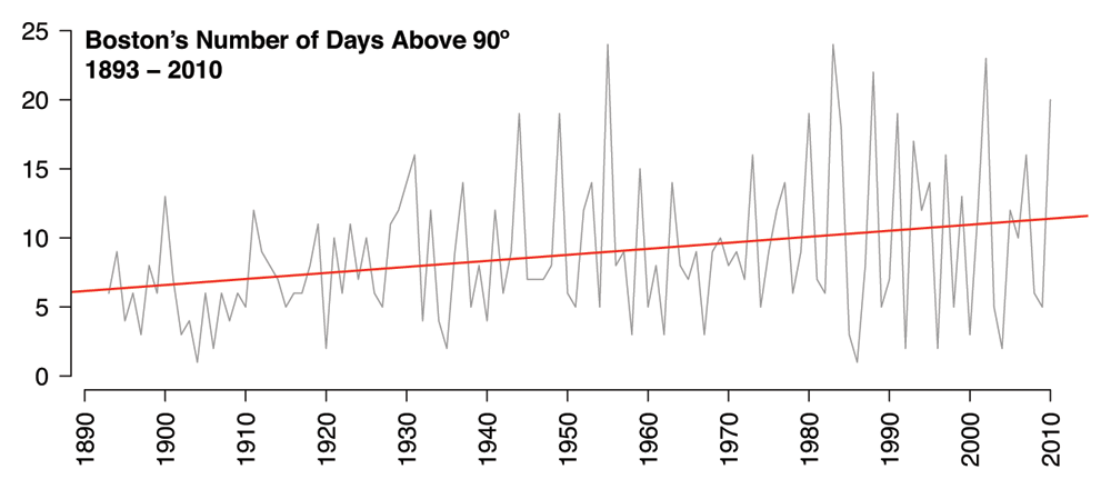
It’s also worth noting that Boston now gets about twice as many days above 90 degrees per year as it did at the turn of the last century. In the first twenty years of the data (1893 - 1912), Boston had an average of six days per year above 90 degrees. In the most recent twenty years (1991 - 2010), Boston had an average of eleven. The same statistically significant, upward trend is also apparent:
 An Inconvenient Truth was produced shortly after Hurricane Katrina hit New Orleans, and so Mr. Gore took care to point out that warmer temperatures put more moisture in the atmosphere, which ultimately produces more powerful storms. So, if Boston is getting warmer, might we see a comparable increase in annual rainfall?
 Yup. Once again, the regression line is significant (p = .001), indicating that rainfall totals have been steadily increasing over the years. Boston gets about seven more inches of rain now than it did in 1893, which is pretty striking, since an inch of rain contains a lot more moisture than an inch of snow (I’ve heard that an inch of rain works out to about a foot of snow).
Looking at this plot, you can see that the 1950s were bizarrely wet. In fact, the four wettest years in the data set are all from the ’50s. The wettest year is 1954 (62.5 inches), during which Boston was battered by two hurricanes, Carol and Edna, in rapid succession. Next on the list is 1958, which is a bit of a mystery. The only hurricane of note for the United States that year was Hurricane Helene, but it didn’t cause much trouble for Boston. There were, however, two unusually strong storms at the very end of winter. Here’s an actual NOAA report on the matter dating from 1958. The single wettest day on record is August 19th, 1955, during which the city was pelted with just over seven inches of rain. This was the worst day of Hurricane Diane’s Boston tour, which loosed a total of 12.4 inches of rain over the course of three days.
In short, we can conclude that Boston is both warmer and wetter than it was a century ago, with no sign of slowing down. As if to add insult to injury, it appears that the increases in temperature and rainfall have had no real effect on annual snowfall. If anything, annual snowfall totals have trended slightly upward in recent years, albeit not significantly.
Concluding Remarks
So, what have we learned today?
The winter of 2011, the awfulness of which prompted me to seek these data in the first place, was awful in a highly unusual way. Sure, it was snowier than average, but that wasn’t the real problem. This winter was an extremely snowy one, albeit not unusually cold. Rather, temperatures hovered in a small, frustrating range that deprived the city of about two weeks’ worth of thaw weather. That lack of melt made a world of difference.
Speaking of worlds, climate change is real. Even my amateurish, admittedly clunky analyses makes that glaringly obvious. Boston’s temperatures are on the rise and we’re getting heavier rain. In a coastal city where most of the architecture predates the invention of air conditioning, these findings should prompt serious concern. My analysis is mostly in agreement with more official climate reports.
If you poke around and look for the record highs and lows, it becomes obvious that one should never confuse an isolated hot or cold spell for the slow moving, long-term effects of climate change. The coldest day ever recorded in the city was February 9th, 1934, which hit a bone-chilling low of -18 degrees. Conversely, the hottest day on record occurred way back on July 4th, 1911, when thermometers reached a scorching 104 degrees. This corresponds to a historic heatwave that killed 380 people throughout the Northeast.
Lastly, I’d like to point out that this analysis was generated from freely-available data, analyzed with a freely-available programming environment, and presented to you on a freely-available blogging platform. Anyone could have done what I’ve done here, given sufficient knowledge and motivation. If you lack sufficient knowledge and motivation, but still want to explore the data, WeatherSpark has you covered (though their Boston data only goes back to 1948, amateurs).
2011 may have been a bad year for winters, but as far as freedom of information goes, it’s a pretty interesting year to be alive.
-
In fact, December and March have statistically equal snowfall totals (p = 0.56, paired t-test). ↩
-
My method for calculating average temperature is admittedly a little crude. I average the high and low temperatures for each day, then take the average of that for each winter, which is comprised of that year’s January, February, and the preceding December. More on that in the next footnote. ↩
-
Defining “winter” raised an interesting problem. Would the “Winter of 2011” simply include the calendar months of 2011? Or is it instead measured by counting the early months of 2011 and the late months of 2010? I guessed that for the sake of analysis, any year’s “winter” should include parts of the previous calendar year. As it turns out, the NOAA measures winters from the preceding July through the next June. My numbers agree with the official totals to within a few fractions of an inch, so I’m happy. For the sake of simplicity, my winters include January, February, and the previous December. ↩
-
Two things. One, I defined a “snowfall day” as any on which at least a tenth of an inch fell, which seemed like the smallest amount that would be noticeable to a casual observer. Two, in case you were wondering, 1948 is the year that takes the prize for most days on which snow fell. It snowed on 29 separate days. Things got so bad that the mayor of Boston got in touch with the president of MIT to ask about the practicality of flamethrowers. ↩
-
Liberally defined as any day in winter with a high temperature greater than 32 degrees. Of course, a day that hit 33 degrees for an hour wouldn’t meaningfully melt the snow, but even applying higher cutoff temperatures doesn’t change 2011’s position much, and in fact makes 2011’s lack of thaw slightly more extreme. And yes, I know that a histogram should have a baseline of zero. But in this particular case, I think all that does is hide the annual variability in thaw days. ↩
-
Again, I’m not a climate scientist, and my method here is pretty crude: average the highs and lows for each day, then compute the average of that for each year. ↩
posted March 16 2011
probability for the common dungeon master
While wandering around PAX East’s gargantuan Expo Hall, I found myself inexplicably drawn, over and over, to the Chessex booth. This is a company whose sole product is dice. Don’t be fooled by their awful website, these people are serious about their product. The booth was bordered by bin after bin of dice, meticulously arranged by color and number of sides. They had dice of every hue, material, size, and shape you could possibly imagine, and many that you couldn’t. I picked up a set of 6-sided dice labeled in Roman numerals for the Tall One, as well an odd pair whose sides were labeled as noun/verb/adjective and who/what/when/where/why/how. On dice! Also one with some mathematical symbols on it. And two 6-sided dice that I just really, really liked the look of. It was at this point that I finally managed to wrench myself from Chessex’s candy-colored grasp, gazing in wonder at the hive-like activity of nerds picking out dice, like bees pollinating a field of flowers.
Did I need these dice? No, of course not, but that’s hardly the point, and at about 50 cents apiece, it’s not like I’m risking a plunge into massive dice debt. My recent purchases have, however, gotten me thinking about dice and basic probability. Given a roll of two dice, how likely are you to get a particular value? What patterns do these numbers obey? Just how lucky is 7? If the guy running an RPG tells you that you need “a 6 or better” to win this encounter, just how easy or hard is that? I’m not an expert in probability or even a mathematician, but I thought it’d be fun to investigate these questions. Dice and data come from the same Latin root, after all.
I can remember playing a board game with my dad, maybe Monopoly, maybe Parcheesi, where he decided to drop some Dad Knowledge on me: 7 is the most common roll of the dice. Roll one die, and no matter what number comes up, there’s going to be a number on the second die that can make the two sum up to 7. This is not true of any other combined roll. If I’m trying to roll a 6, for whatever reason, and 6 comes up on the first die, I’m guaranteed to overshoot. So, given a pair of 6-sided dice, 7 is the most common roll. But how common? If I were a proper mathematician, I’d squint really hard and pull an elegant formula from the depths of my brain. But I’m a psychologist and statistician, and increasingly, we prefer R. So I’ve used R to simulate one million rolls of a pair of 6-sided dice. Here’s the resulting distribution of rolls:
 It turns out that these rolls follow a perfectly triangular distribution. I can already hear the statisticians in the audience furrowing their brows, and no, these numbers do not follow the more common normal distribution. The odds do not follow a bell curve, but rather, your odds of rolling a particular number decrease linearly from the peak of 7. This is true of all two-dice rolls, and if you don’t believe me, here’s a simulation of two 20-sided dice:
 Boom. Triangle. Based on these simulations, we can extrapolate some rules for the probability of rolling a particular number. Given a pair of n-sided dice, the most common roll will be n + 1. The odds of this roll are 1/n. The odds of the other rolls decrease linearly as you move away from the peak, bottoming out at a probability of 1/n2 at the ends. So using a set of 6-sided dice, the most common roll, 7, has a one in six chance of being rolled. Rolls of 2 or 12 have just a one in thirty-six chance of appearing.
The statisticians in the audience are probably starting to feel a longing for their beloved normal distribution. Luckily for them, the distribution of possible values starts to approximate a normal distribution as more dice are added. Here’s the simulation for one million rolls of three 6-sided dice:
 This is definitely the familiar bell curve, albeit a slightly platykurtic one. Great word, right? Platykurtic. It means that the peak is slightly flatter than you’d expect compared with a perfect bell curve.
One last thing. I’ve often played tabletop games where I’m told that I need to roll some number or better, for instance, “You need a 7 or better to win this encounter.” Based on the distributions we’ve covered so far, it’s a simple matter to transform them into game-appropriate cumulative functions:
 You have a 100% chance of rolling a 2 or better (duh), whereas you have just a 3% chance of rolling a 12. The curve is nonlinear, a fact which I doubt most DMs ever keep in mind. So if I’m the DM and I want my party to have a 50/50 chance of winning the battle using their 6-sided dice, the roll they need is 7.5 or better. Obviously that’s not possible, so the real question is whether I want the roll to be slightly easier (7 or better) or slightly harder (8 or better). What I find interesting is that 8 feels like a fairly high roll, but in fact, you’ll roll an 8 or better 42% of the time.
If you’re rolling a single die the odds of getting any particular number are uniform, assuming the die is fair. But the minute you start messing around with multiple dice, the underlying distribution changes and begins to approximate the probabilities of real-world statistics. The more you know, right?
posted March 15 2011
the 3d wasteland
In 1961, newly elected FCC chairman Newton N. Minow (actual name) famously declared that television was a “vast wasteland”. Minow believed that television had the potential to be something truly great, but then, as now, it was too full of superficial, meaningless garbage and grating, obnoxious advertisements.
Fifty years after Minow’s speech, I couldn’t help but think of him as I toured the exhibition floor of the Penny Arcade Expo and evaluated the plethora of 3D technology on display. I might be misremembering last year’s PAX, but it seemed like the only 3D technology on the floor then was a small section of NVIDIA’s booth, a timid, tentative offering that nevertheless managed to draw a perpetual crowd. This year, NVIDIA was pushing 3D as hard as it could. Its booth—more accurately described as a small mall of game technology, such was its size and layout—was dominated by 3D. The booth was fronted by a 3D-capable monitor 103 inches in size. Passersby could pick up any one of a dozen 3D glasses to experience the effect for themselves.
That experience, I’m sorry to say, is disappointing. It’s not that it doesn’t work; I’m practically stereoblind, and even I was able to perceive some depth in the displays. But just because a thing works, that doesn’t mean that it’s worth your time. 3D projection is taxing on two fronts: it requires a variety of technological trade-offs to work properly, and makes unusual, often uncomfortable demands of an observer’s visual system.
The biggest trade-off is brightness. One way or another, the 3D setup has to send two separate images to each of your eyes. This means that the image is going to look, at best, half as bright as it would under 2D viewing conditions. This may be acceptable in a movie theater, where you’re sitting in front of a massive screen that pours tons of light into an otherwise completely dark environment, but it’s terrible in the context of a living room or a show floor. With my 3D glasses on, screen images appeared dismally murky. Details were lost and some scenes became entirely unintelligible. The goggles felt awkward to wear, especially over my eyeglasses. In short, it’s an uncomfortable viewing experience of questionable value, to say nothing of the cost of the technology. No person is in his right mind would spend the hundreds, possibly even thousands, of dollars necessary to play a 3D game in his own home.
One intriguing alternative is Nintendo’s 3DS, which uses a variation of the “hologram” cards that were popular in the 80s (you know, hold it at one angle, you see one picture, hold it at a different angle, you see another). When you hold the 3DS at just the right angle, the screen beams two separate images into each eye, creating a depth percept without the need for expensive monitors or dim glasses. The image is bright, and lining yourself up is simple. That the effect works at all is extremely impressive, but I still question the practically. If you’re like me, you move around when you play games, and if you move the 3DS out of its narrow “sweet spot,” you’ll get a double image instead of 3D. Though promising, it’s worth keeping in mind that this method will only work with a handheld system, and cannot be adapted for a television.
Now let’s talk vision science. For the record, what I have to say here applies to 3D movies as well. 3D projection is not natural, or as we might say in the lab, it’s not ecologically valid. The human eye regularly performs two related but independent actions: convergence and focus. Hold up a finger at arm’s length, then move it toward your face. As you keep your eyes on your finger, you’ll notice two things. One, your surroundings will fall out of focus as your finger gets closer to your face. Two, your eyes might start to feel weird. This is because they’re converging at a fairly extreme angle. Essentially, you’re crossing your eyes. Out in the real world, focus and convergence always change in tandem. But in a 3D movie or game, your point of focus is constant (the screen), while convergence changes depending on the contents of the scene. I don’t suppose you’ve seen the trailer for Pirates of theCaribbean 4? The trailer is in 3D, and like most trailers, it cuts rapidly from shot to shot. The depth plane changes every few seconds, and it’s completely exhausting. The human visual system simply isn’t built to process the world this way.
3D suffers from artistic problems, too. Designers and directors have had over a hundred years to learn how light, color, texture, and spatial arrangement affect a scene. We have no such body of knowledge for the manipulation of depth (da Vinci and Picasso notwithstanding). Nobody designing 3D games, or directing 3D movies, really knows how to use 3D effectively. I watched someone play World of Warcraft in 3D for about fifteen minutes. Every time he killed a monster, a large notification would float over the screen at the front of the depth plane, obstructing the ongoing action. The effect was distracting and ugly. And we’re talking about Blizzard! A company that spends years meticulously honing its games for the optimal playing experience, one of the few companies that actually conducts rigorous research for these sorts of issues. If Blizzard can’t do it right, who can?
Since I’m not stereoscopically normal (neither is Penny Arcade’s Mike Krahulik, apparently), I went out of my way to ask other people at the show how they felt about 3D. Most people at the NVIDIA booth seemed unimpressed. They complained about the subtlety of the 3D effect, the dimness of the images, eye strain, the inability to spectate if you weren’t wearing 3D glasses, and the general awkwardness of these systems. People were more positive when asked about the Nintendo 3DS, which makes a certain amount of sense, as Nintendo’s system is much less cumbersome and produces brighter images.
So that’s the shape of 3D: a wasteland of finicky technology, dark, muddled images, and uncomfortable customers who can barely manage to feign enthusiasm for the duration of a show, let alone hours in the living room. That kid playing World of Warcraft? He wasn’t playing it because it was 3D. He was playing it because he loves World of Warcraft. If 3D is to have any kind of future, it needs to create compelling experience that you can’t get in 2D, and I’m not sure that such a thing is possible.
During my hours in the exhibition hall, I also caught Ubisoft’s Child of Eden. More accurately, it caught me, as well as everyone else who passed within sight of it. Child of Eden looks like something out of the year 2045, a rhythm-based first person shooter that relies on the Xbox Kinect for interaction. Players fly through the game’s trippy environments simply by waving their hands. I didn’t get a chance to play it for myself, but even as a spectator, the experience is incredibly immersive. The flowing visuals and organic pace of action are mesmerizing, and seeing players control the game without a physical controller was downright arresting. An awe-inspiring piece all around, and not a 3D goggle in sight.