posted August 17 2015
understanding ggplot: an example
If you use R, odds are good that you’ve also come across ggplot2, by Hadley Wickham. This wildly popular plotting package is one of the most useful tools in the entire R ecosystem. If it didn’t exist, I would have had to invent it (or a significantly inferior version of it). ggplot’s elegant, powerful syntax can turn you into a data vis wizard, if you know what you’re doing. It’s getting to “I know what I’m doing” that can be tough.
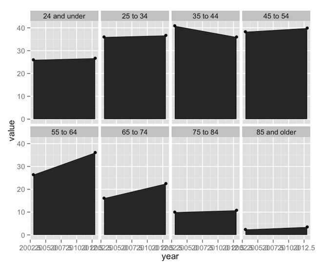
Earlier today, I came across a Bloomberg article on how more older drivers are staying on the road and becoming the auto industry’s fastest-growing demographic. It’s an interesting read, but what caught my attention was this figure:

From a data visualization standpoint, this plot is actually several flavors of weird and bad (more on that later), but suppose you find yourself enamored of its fun colors and jaunty angles, and maybe you want to see how much of this you can replicate purely with ggplot.
First thing’s first, download the data, which has just three columns: age.group, year, and value. Next we’ll calculate a marker for whether the number of drivers in an age group is increasing, as well as the actual percentage change:1
data.bloom <- ddply(data.bloom, .(age.group), mutate,
                    is.increasing = value[year == 2013] >= value[year == 2003],
                    percent = (value[year == 2013] - value[year == 2003]) / value[year == 2003] * 100
);
And now we’re ready to plot! Let’s get the basics going:
plot.bloom <- ggplot(data=data.bloom, aes(x = year)) +
  geom_ribbon(aes(ymin = 0, ymax = value)) +
  geom_point(aes(y = value)) +
  facet_wrap(facets = ~age.group, nrow = 2);
print(plot.bloom);
ggplot’s syntax often mystifies new users, so let’s go through it.
- Line 1 is the main call to ggplot. It’s what tells R that we’re building a new ggplot object. The
ggplot()function really only needs two arguments: a dataset (self-explanatory) and a set of aesthetics, defined in the mysteriousaes()function called inside ofggplot(). ggplot will attempt to go through each individual row of the dataset and put it on our plot. The aesthetics defined inaes()tell ggplot which columns define which properties of the plot. In this main call toaes(), I’ve only specified that “year” should go on the x-axis. Notice that I can refer to the “year” column by name alone; no quotes, no reference to its parent data frame. Theaes()function implicitly knows about its associated dataset. This aesthetic mapping will then trickle down to every subsequent piece of the plot (unless I change the aesthetic mapping later on down the line). - Line 2 is our first geom, which defines a graphical object. In this case, I’m using
geom_ribbon(), which is useful for building polygonal shapes such as shaded regions, error bars, highlights, and so on. Thegeom_ribbon()function is pretty smart; it wants you to define “ymin”, “ymax”, “xmin”, and “xmax”, but if you give it just “x”, it’ll use that value for the min and max values. Since we already defined “x” up inggplot(), we just have to give it “ymin” and “ymax”. Here I’m saying that I want “ymin” to always be 0, and “ymax” to take on the data values. - Line 3 calls
geom_point(), and it does what it says on the tin. It already has “x” from the call toggplot(), and it needs a “y”. In this case, that’s just “value” again. - Line 4 calls
facet_wrap(). Faceting, an implementation of the small multiples technique, is perhaps the most powerful feature of ggplot. Faceting makes it possible to take a plot and split it into smaller sub-plots defined by some other factor or combination of factors. Our call tofacet_wrap()simply says to split the plot up by “age.group”, and arrange the resulting set of sub-plots into exactly 2 rows.2
Four lines of code3, and we’re 90% of the way there. This is the point at which you’d call over your boss to show him your new, exciting, preliminary finding. But you wouldn’t call over your boss’s boss. The plot needs more work first. The labeling on the x-axis is screwy and there’s a distinct lack of eye-catching color here. Let’s fix that.
plot.bloom <- ggplot(data=data.bloom, aes(x = year)) +
  geom_ribbon(aes(ymin = 0, ymax = value, fill = is.increasing)) +
  geom_point(aes(y = value)) +
  facet_wrap(facets = ~age.group, nrow = 2, scales = 'free') +
  scale_x_continuous(breaks = unique(data.bloom$year), expand=c(0.16, 0)) +
  scale_fill_manual(values=c('TRUE'='#99e5e5', 'FALSE'='#f27595'));
print(plot.bloom);
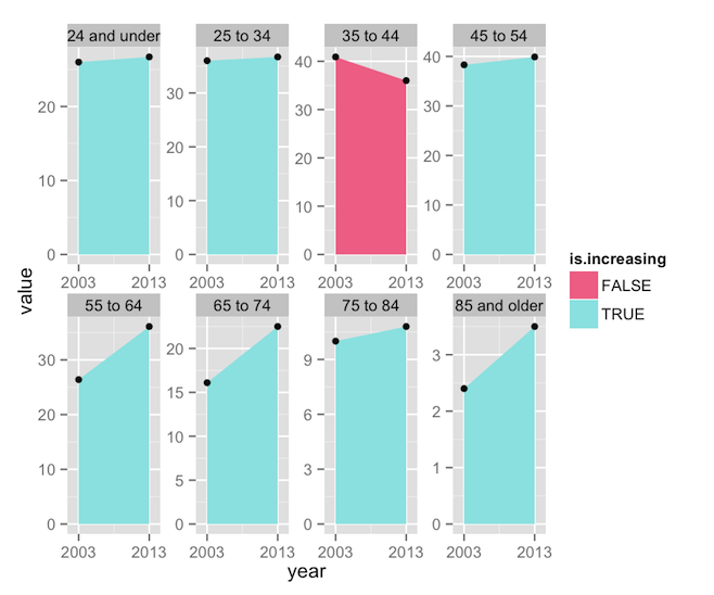
Here are the changes I’ve made:
- Line 2 now adds
fill = is.increasingto the aesthetics. This will color the polygons according to whether “is.increasing” is TRUE or FALSE. - Line 6’s call to
scale_fill_manual()tells ggplot that the “fill” aesthetic is going to be controlled manually. While there a number of built-in color scales,such as scale_fill_brewer()orscale_fill_grey(),scale_fill_manual()simply allows us to define our own colors. In this case, I’ve picked the specific colors from the Bloomberg figure, and mapped them to the two possible values in the “is.increasing” column. - Line 5 calls
scale_x_continuous(). Since our “year” column is numeric data, ggplot assumes that 2003 and 2013 are just two points on a line (you can see lots of intermediate values in the plot above, as ggplot attempted to create neatly spaced tick marks). One way to clear up the labels would be to convert the year column to a factor, and then ggplot would label only the values that exist in the dataset. Another way would be to convert the year column to Date objects, and usescale_x_date(), but that’s overkill here. Instead, I’ve simply used the “breaks” argument to restrict labeling to the two values found in the dataset. The two-element vector being sent to “expand” tells ggplot how much padding to add to the ends of the x-axis. The first value defines a percentage value (16% here), while the second would add some raw value (here, some number of years). The default isc(0.04, 0), so I’ve essentially just increased the padding a little. - Lastly, Line 4 adds
scales = 'free'tofacet_wrap(). In the previous plot, notice that each facet shared the same axes, and axis values were only written on the far left and bottom of the plot. This is efficient and readable, but it’s not how the Bloomberg plot does things. For the sake of replication, we need x-axis labels on each facet.
We’re getting closer, but these changes have produced some undesirable effects. The use of a fill aesthetic has caused ggplot to helpfully add a legend, which we don’t want, while the use of scales = 'free' has caused each facet to plot the data against its own set of y-axis limits, losing the nice comparable scaling we had before. We can keep the individual axes and the unified scaling with one addition:
plot.bloom <- ggplot(data=data.bloom, aes(x = year)) +
  geom_ribbon(aes(ymin = 0, ymax = value, fill = is.increasing)) +
  geom_point(aes(y = value)) +
  facet_wrap(facets = ~age.group, nrow = 2, scales = 'free') +
  scale_x_continuous(breaks = unique(data.bloom$year), expand=c(0.16, 0)) +
  scale_y_continuous(limits=c(0, 50), expand=c(0, 0)) +
  scale_fill_manual(values=c('TRUE'='#99e5e5', 'FALSE'='#f27595'));
print(plot.bloom);

Line 6 establishes explicit limits for the y-axes (ranging from 0 to 50), and knocks out the padding entirely, so that the data touches the y-axis, as in the Bloomberg plot. But wait! The Bloomberg figure also prints the value of each data point, and includes the written percentage as well. Two calls to geom_text() can get that done:
plot.bloom <- ggplot(data=data.bloom, aes(x = year)) +
  geom_ribbon(aes(ymin = 0, ymax = value, fill = is.increasing)) +
  geom_point(aes(y = value)) +
  geom_text(aes(label = sprintf('%0.1f', value), y = value), vjust = -1, size=3) +
  geom_text(subset=.(year == 2013), aes(label = sprintf('%+0.1f%%', percent)), x = 2008, y = 0, vjust = -1, fontface = 'bold', size=3) +
  facet_wrap(facets = ~age.group, nrow = 2, scales = 'free') +
  scale_x_continuous(breaks = unique(data.bloom$year), expand=c(0.16, 0)) +
  scale_y_continuous(limits=c(0, 50), expand=c(0, 0)) +
  scale_fill_manual(values=c('TRUE'='#99e5e5', 'FALSE'='#f27595'));
print(plot.bloom);

Lines 4 and 5 accomplish similar things, so let’s just focus on line 5:
- Notice that the “label” argument inside
aes()invokessprintf(), which is a very handy way of ensuring that the percentage values are all neatly rounded to one decimal place and attached to a percent symbol. It’s possible to do these types of transformations within ggplot, thus saving you the trouble of having to create transforms within the dataset itself. - “x” is set to 2008, which is halfway between 2003 and 2013, thus ensuring that the label appears at the horizontal center of the plot. Note that “x” is set outside of
aes(). You can do that if you’re setting an aesthetic to a single value. - Likewise, “y” is always 0, the baseline of the plot, and a “vjust” of -1 will set the text slightly above that baseline.
- The “fontface” and “size” attributes should be fairly self-explanatory.
- Lastly, remember when I said that ggplot wants to plot every row in your dataset? This means that ggplot would print the percentage values twice, right on top of each other, since they appear twice (one per age group). The “subset” parameter ensures that I’m only pulling the labels once.
Finally, the rest is cosmetic:
plot.bloom <- ggplot(data=data.bloom, aes(x = year)) +
  geom_ribbon(aes(ymin = 0, ymax = value, fill = is.increasing)) +
  geom_point(color='white', size=3, aes(y = value)) +
  geom_point(color='black', size=2, aes(y = value)) +
  geom_text(aes(label = sprintf('%0.1f', value), y = value), vjust = -1, size=3) +
  geom_text(subset=.(year == 2013), aes(label = sprintf('%+0.1f%%', percent)), x = 2008, y = 0, vjust = -1, fontface = 'bold', size=3) +
  facet_wrap(facets = ~age.group, nrow = 2, scales = 'free') +
  scale_x_continuous(breaks = unique(data.bloom$year), expand=c(0.16, 0)) +
  scale_y_continuous(limits=c(0, 50), expand=c(0, 0)) +
  scale_fill_manual(values=c('TRUE'='#99e5e5', 'FALSE'='#f27595')) +
  labs(x=NULL, y=NULL) +
  theme_classic() + theme(legend.position='none',
                          axis.line.y=element_blank(),
                          axis.ticks.y=element_blank(),
                          axis.text.y=element_blank(),
                          axis.text.x=element_text(color='#aaaaaa'),
                          strip.text=element_text(face='bold'),
                          strip.background=element_rect(fill='#eeeeee', color=NA),
                          panel.margin.x = unit(0.25, 'in'),
                          panel.margin.y = unit(0.25, 'in')
  );
print(plot.bloom);

- Lines 3 and 4 create two duplicate sets of points, in black and white, thus creating a white outline around the points.
- Line 11 turns off the axis labeling.
- Line 12 tells ggplot to use its built-in “classic” theme, which features a white background and no gridlines, thus saving us some typing in
theme(). - Lines 12-20 are just one big adventure in the aforementioned
theme(), which allows us to control the style of the plot. ggplot builds everything out of some basic theme elements, includingelement_rect(),element_text(), andelement_line(). Setting any parameter of the theme toelement_blank()removes that element from the plot itself, automatically re-arranging the remaining elements to use the available space.4
As far as I’m aware, this is as close as you can get to reproducing the Bloomberg plot without resorting to image editing software. ggplot can’t color facet labels individually (notice that in the Bloomberg version, the labels for the two oldest age groups are a different color than the rest). While I could muck around with arrows and label positioning for the percentage values, it would involve a lot of finicky trial and error, and generally isn’t worth the trouble.
So, we’ve done it. We’ve replicated this plot, which is horrible for the following reasons:
- The primary data are redundantly represented by three different elements: the colored polygons, the data points, and the data labels.
- Percentage change is represented by two separate elements: the color of the polygon and the printed label.
- The repetition of the axis labels is unnecessary.
- Splitting the pairs of points into a series of eight sub-plots obscures the relationship between age group and the number of active drivers. There’s a lot of empty space between the meaningful data, and the arrangement of sub-plots into two rows makes the age relationship harder to examine.
Using the same dataset, one could write this code:
plot.line <- ggplot(data=data.bloom, aes(x = age.group, y = value, color = as.factor(year))) +
    geom_line(aes(group = year)) +
    geom_point(size = 5.5, color = 'white') +
    geom_point(size = 4) +
    geom_text(aes(label=sprintf('%+0.1f%%', percent), color = is.increasing), y = -Inf, vjust = -1, size=3, show_guides=F) +
    geom_text(data=data.frame(year=c('2003', '\n2013')), aes(label=year), x=Inf, y = Inf, hjust=1, vjust=1) +
    scale_y_continuous(limits = c(0, 45)) +
    labs(x = 'Age Group', y = 'Number of Licensed Drivers (millions)') +
    scale_color_manual(values = c('FALSE'='#f00e48', 'TRUE'='#24a57c', '2003'='lightblue', '2013'='orange', '\n2013'='orange')) +
    theme_classic() + theme(legend.position = 'none',
                            axis.line = element_line(color='#999999'),
                            axis.ticks = element_line(color='#999999'),
                            axis.text.x = element_text(angle=45, hjust=1, vjust=1)
                        );
print(plot.line)
And produce this plot:

You could argue with some of the choices I’ve made here. For example, I’m still using points and lines to encode the same data. But I tend to subscribe to Robert Kosara’s definition of chart junk, which states that, “chart junk is any element of a chart that does not contribute to clarifying the intended message.” Here, the lines serve to remind the audience that the data are on a rough age continuum, while the points clarify which parts are real data and which are interpolation. I’ve also added color to the percentage change values, as I feel it’s important to highlight the one age group that is experiencing a decrease in licensure. Eagle-eyed readers will probably notice that I’m abusing ggplot a little, in that I’ve supressed the automated legend and am using geom_text() to create a custom legend of colored text (and the tricks I had to pull in scale_color_manual() are just weird).5
So what have we learned about ggplot? Look at how much explaining I had to do after each piece of code. This tells you that ggplot packs an awful lot of power into a few commands. A lot of that power comes from the things ggplot does implicitly, like establishing uniform axis limits across facets and building sensible axis labels based on the type of data used for the “x” and “y” aesthetics. Notice that ggplot even arranged the facets in the correct order.6 At the same time, ggplot allows for a lot of explicit control through the various scale() commands or theme(). The key to mastering ggplot is understanding how the system “thinks” about your data, and what it will try do for you. Lastly, notice that I was able to cook up a basic visualization of the data with just a few succinct lines of code, and gradually build the visualization’s complexity, iterating its design until I arrived at the presentation I wanted. This is a powerful feature, and one ideal for data exploration.
Feel free to grab the data and R code for this project.
-
We will, of course, be using plyr, another indispensible tool from the mind of Dr. Wickham. In this case, we use
mutate()in the call toddply()to add two new columns to the dataset (which I’m calling “data.bloom”). For each age group, calculate whether the value increases from 2003 to 2013 (“is.increasing”), and the percentage change (“percent”). ↩ -
Note that
facet_wrap()andfacet_grid()use an elegant formula interface for defining facets, of the formrows ~ columns. In this case, I only need to define either the rows or the columns. But in another dataset I could facet, say,age.group + income ~ gender. ↩ -
Technically everything before
print()is a single line of code, and I’m inserting line breaks for readability (notice the+signs at the end of each line, which connect all of the ggplot commands). ↩ -
ggplot’s sensible way of handling the automatic layout and scaling of plot elements is half the reason I prefer it over the base plotting system. ↩
-
And notice my use of
y = -Infin the call togeom_text(). This tells ggplot to place the text at the minimum of the y-axis, whatever that might turn out to be, a very useful feature that is documented nowhere. ↩ -
Really, we just got lucky there. When you are faceting based on character data (as we are here), ggplot attempts to arrange facets alphabetically, which works to our favor in this case. If you needed to place the facets in an arbitrary order, your best bet would be to convert your faceting columns into ordered factors, in which case ggplot will place the facets using the underlying order. ↩