posted May 20 2011
all about the weathah
Update: Several alert readers have pointed out that my snowfall total for 2011 doesn’t seem to match other prominent reports. To double check myself, I downloaded the newest data set available from the Utah University Climate Center. To my surprise, the snowfall total is now dramatically larger. My previous data set was downloaded only about a month ago. I’m not sure why the snowfall totals would have been so inaccurate. Perhaps certain measurements lag behind more than others. In any event, my thanks go out to my commenters.
The annual snowfall plot has been amended (other plots were not changed by the update), and parts of the post have been rewritten to reflect the update.
We Bostonians have a lot of pride. Our pride runs the gamut from our sports teams to our collective intellectual superiority. More than anything, though, we’re proud of our weather, or rather, our ability to survive it. That doesn’t mean that we don’t love to bitch and moan about how horrible it is, every single year.
The winter of 2011 was widely regarded as one of the worst this nation has ever faced. At one point, snow covered portions of 49 out of 50 states. Boston was no exception. Desperate to reduce the burden created by the accumulation of tons and tons of unmelting snow, a state senator at one point suggested that we dump our excess snow into Boston Harbor.
This winter was a bad one, certainly. But as the temperatures rose and the banks of snow finally started to melt away, I got to wondering: How bad, exactly? Where does this winter rank in the history of Boston’s winters, and what, specifically, made it so unusually harsh? Being a scientific sort of guy, I’ve taken it upon myself to examine these and a few other questions about Boston’s weather patterns.
Enormous, Italicized, Electroluminescent, Mile High Disclaimer
Climatology is very complicated. I am not now, nor have I ever been, a climatologist. I’m just a guy with a background in the scientific method, an obsession with the crunching of numbers, and a knack for presenting the results. What follows is a fun project I wanted to do. Don’t take the results as gospel.
About the Data
The analysis presented here is based on freely-available data from the Utah State University Climate Center. The specific data used come from two weather stations. Data from 1920 through the present come from the NOAA weather station at Logan Airport (FYI, the weather station appears to predate the airport). Data prior to 1920 come from another weather station that was located just off of Boston Common, which operated until 1935.
The fifteen year overlap in the operations of the two stations allowed me to compare their measurements day-to-day, and they are in nearly perfect agreement. Therefore I’ve combined the data into a single set that spans a period of just under 118 years, from 1893 to now. Put another way, that’s weather data for the last 43,114 days. I could have gotten a few more years of historical data by incorporating readings from stations in Boston’s outlying suburbs, but the few extra years I’d gain from this didn’t seem worth the potential disadvantages of incorporating data from outside the urban microclimate.
Data were analyzed and plots were created with R and that hot new kid on the block, the instantly indispensable RStudio.
The Winter
Bostonians react to the news of an oncoming December storm with the sort of conduct usually reserved for an Apocalypse. We swarm the nearest supermarket and pick it clean of chicken, bread, eggs, milk, and rock salt, as if it’s just been announced that the rotation of the Earth is going to grind to a halt and trap us in an eternal, frozen night. We love the drama and pretend to panic, sure, but nobody’s really surprised to see that first December snowfall. On the other hand, we’re always shocked—shocked—to see a snow storm in March. That’s a little strange, given how the numbers stack up:
 Unsurprisingly, Boston receives the bulk of its snowfall in January and February, just over a foot per month. The city also gets just under eight inches of snow in both December and March. It’s interesting that we tend to think that December is snowier than March, but in reality, they receive equal amounts of snow.1
Small amounts of “freak” snow can occur at almost any time of year. For instance, just shy of an inch fell on May 8th, 1938. The Junes of 1952 and 1992 somehow saw trace amounts of snow as well. The only month of the year in which snow has never been recorded is, somewhat surprisingly, September.
On the other end of the scale, the single snowiest day in Boston was fairly recent: February 17th, 2003, on which we received 23.6 inches. The second runner-up is—laugh with me now—April Fool’s Day of 1997 (22.4 inches). Third on the list is January 20th, 1978 (21.0 inches). Oddly enough, this is not the legendary Blizzard of ‘78, which didn’t hit Boston until about two weeks later, on February 6th. That storm deposited 27.1 inches of snow over the course of two days, and was at the time a record-breaker. You have to go back twenty more years, to February 16th, 1958 (19.3 inches) to find the next-highest snowfall. As for our easiest winter, the medal goes to 1937, during which Boston received just a bit over nine inches. It was also the sixth-warmest winter on record, with an average temperature of 35.2 degrees.2 That must have been nice.
But let’s get back to the present. How does the winter of 2011 stack up against history?3 The average temperature was 29.9 degrees 30.2 degrees, which is about average. It snowed on 19 separate days, which is also average which is a little more frequent than usual.4 We did, however, receive almost a foot more snow than is normal about twice our normal annual snowfall (thank you again, to the commenters who got me to double check my data source):

This was surprising to me. The snowfall total is certainly above average, but not as high as I would have thought, especially in light of how terrible this winter felt. So given the fairly average temperature, average snow frequency, and non-catastrophic snowfall total (relative to, for instance, 1996 and 1994), what made this winter feel so unendingly, mercilessly awful?
Boston got absolutely hammered this winter, receiving nearly 80 inches of snow, making it the eighth-snowiest winter on record. But there’s something highly unusual about this winter that made it even more brutal.
 This plot represents the number of days in each winter with a high temperature above freezing.5 In other words, the number of days on which snow could thaw. As you can see, the winter of 2011 was very unusual. Temperatures never dipped all that low, but neither did they manage to climb above freezing very often. All told, Boston had about two weeks fewer thaw days than it usually does.
Such a low number of thaw days is quite rare. This, I think, is what really made this winter so bad. It snowed, and then the snow stayed. Twelve inches of snow might make for a bad commute, but if it hits 50 degrees the next day, it isn’t really a long-term problem. If, however, the twelve inches sit on the ground until another eight inches comes along and turns it into a mountain of twenty, that’s a problem. Landlords get lazy about shoveling. Pedestrians tire of trudging through the increasingly treacherous sidewalks. Politicians go snow mad and start to talk of dumping it all into the harbor or melting it down with flamethrowers.
Climate Change
We’ve been hearing a lot about climate change over the last few years, thanks in no small part to Vice President Al Gore. Perhaps you’ve seen his movie, or read his book, or his other book. I don’t mean to sound sarcastic here. The signs of man-made climate change are varied and pervasive. Converging streams of evidence from diverse fields of science all strongly indicate that the planet’s average temperature has been rising gradually since the Industrial Revolution. Since my data just happen to start at the beginning of industrialization, I wondered if my simple measurements would show any evidence of a warming trend.
 Why yes, they do. The orange line in this plot is a simple linear regression through Boston’s average annual temperature.6 The slope of the regression is statistically significant (p < .0001), or in English, temperatures do appear to be climbing steadily upwards, much more so than you’d expect from random fluctuations. The data indicate that since 1893, Boston’s average temperature has increased 2.3 degrees. 2010 was objectively the hottest year on record for the city.
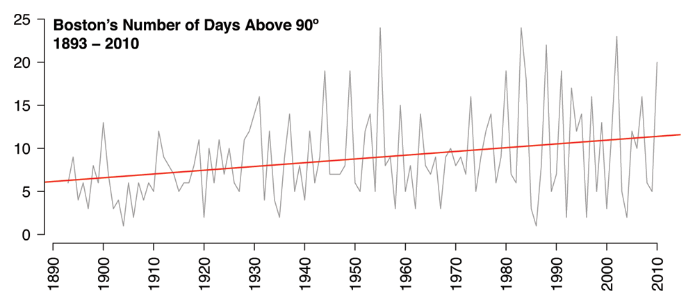
It’s also worth noting that Boston now gets about twice as many days above 90 degrees per year as it did at the turn of the last century. In the first twenty years of the data (1893 - 1912), Boston had an average of six days per year above 90 degrees. In the most recent twenty years (1991 - 2010), Boston had an average of eleven. The same statistically significant, upward trend is also apparent:
 An Inconvenient Truth was produced shortly after Hurricane Katrina hit New Orleans, and so Mr. Gore took care to point out that warmer temperatures put more moisture in the atmosphere, which ultimately produces more powerful storms. So, if Boston is getting warmer, might we see a comparable increase in annual rainfall?
 Yup. Once again, the regression line is significant (p = .001), indicating that rainfall totals have been steadily increasing over the years. Boston gets about seven more inches of rain now than it did in 1893, which is pretty striking, since an inch of rain contains a lot more moisture than an inch of snow (I’ve heard that an inch of rain works out to about a foot of snow).
Looking at this plot, you can see that the 1950s were bizarrely wet. In fact, the four wettest years in the data set are all from the ’50s. The wettest year is 1954 (62.5 inches), during which Boston was battered by two hurricanes, Carol and Edna, in rapid succession. Next on the list is 1958, which is a bit of a mystery. The only hurricane of note for the United States that year was Hurricane Helene, but it didn’t cause much trouble for Boston. There were, however, two unusually strong storms at the very end of winter. Here’s an actual NOAA report on the matter dating from 1958. The single wettest day on record is August 19th, 1955, during which the city was pelted with just over seven inches of rain. This was the worst day of Hurricane Diane’s Boston tour, which loosed a total of 12.4 inches of rain over the course of three days.
In short, we can conclude that Boston is both warmer and wetter than it was a century ago, with no sign of slowing down. As if to add insult to injury, it appears that the increases in temperature and rainfall have had no real effect on annual snowfall. If anything, annual snowfall totals have trended slightly upward in recent years, albeit not significantly.
Concluding Remarks
So, what have we learned today?
The winter of 2011, the awfulness of which prompted me to seek these data in the first place, was awful in a highly unusual way. Sure, it was snowier than average, but that wasn’t the real problem. This winter was an extremely snowy one, albeit not unusually cold. Rather, temperatures hovered in a small, frustrating range that deprived the city of about two weeks’ worth of thaw weather. That lack of melt made a world of difference.
Speaking of worlds, climate change is real. Even my amateurish, admittedly clunky analyses makes that glaringly obvious. Boston’s temperatures are on the rise and we’re getting heavier rain. In a coastal city where most of the architecture predates the invention of air conditioning, these findings should prompt serious concern. My analysis is mostly in agreement with more official climate reports.
If you poke around and look for the record highs and lows, it becomes obvious that one should never confuse an isolated hot or cold spell for the slow moving, long-term effects of climate change. The coldest day ever recorded in the city was February 9th, 1934, which hit a bone-chilling low of -18 degrees. Conversely, the hottest day on record occurred way back on July 4th, 1911, when thermometers reached a scorching 104 degrees. This corresponds to a historic heatwave that killed 380 people throughout the Northeast.
Lastly, I’d like to point out that this analysis was generated from freely-available data, analyzed with a freely-available programming environment, and presented to you on a freely-available blogging platform. Anyone could have done what I’ve done here, given sufficient knowledge and motivation. If you lack sufficient knowledge and motivation, but still want to explore the data, WeatherSpark has you covered (though their Boston data only goes back to 1948, amateurs).
2011 may have been a bad year for winters, but as far as freedom of information goes, it’s a pretty interesting year to be alive.
-
In fact, December and March have statistically equal snowfall totals (p = 0.56, paired t-test). ↩
-
My method for calculating average temperature is admittedly a little crude. I average the high and low temperatures for each day, then take the average of that for each winter, which is comprised of that year’s January, February, and the preceding December. More on that in the next footnote. ↩
-
Defining “winter” raised an interesting problem. Would the “Winter of 2011” simply include the calendar months of 2011? Or is it instead measured by counting the early months of 2011 and the late months of 2010? I guessed that for the sake of analysis, any year’s “winter” should include parts of the previous calendar year. As it turns out, the NOAA measures winters from the preceding July through the next June. My numbers agree with the official totals to within a few fractions of an inch, so I’m happy. For the sake of simplicity, my winters include January, February, and the previous December. ↩
-
Two things. One, I defined a “snowfall day” as any on which at least a tenth of an inch fell, which seemed like the smallest amount that would be noticeable to a casual observer. Two, in case you were wondering, 1948 is the year that takes the prize for most days on which snow fell. It snowed on 29 separate days. Things got so bad that the mayor of Boston got in touch with the president of MIT to ask about the practicality of flamethrowers. ↩
-
Liberally defined as any day in winter with a high temperature greater than 32 degrees. Of course, a day that hit 33 degrees for an hour wouldn’t meaningfully melt the snow, but even applying higher cutoff temperatures doesn’t change 2011’s position much, and in fact makes 2011’s lack of thaw slightly more extreme. And yes, I know that a histogram should have a baseline of zero. But in this particular case, I think all that does is hide the annual variability in thaw days. ↩
-
Again, I’m not a climate scientist, and my method here is pretty crude: average the highs and lows for each day, then compute the average of that for each year. ↩